The Oliver Project - EQ Homes
The Oliver Project was designed in collaboration with eQ Homes and West Of Main Shoppe, our furniture store located in Ottawa.
We were involved in the process from start to end, from architectural drawings and material selections, to site walk-throughs and furniture installation! We absolutely love the end result, and tip our hats to all of the collaborators involved in producing this dreamy home.
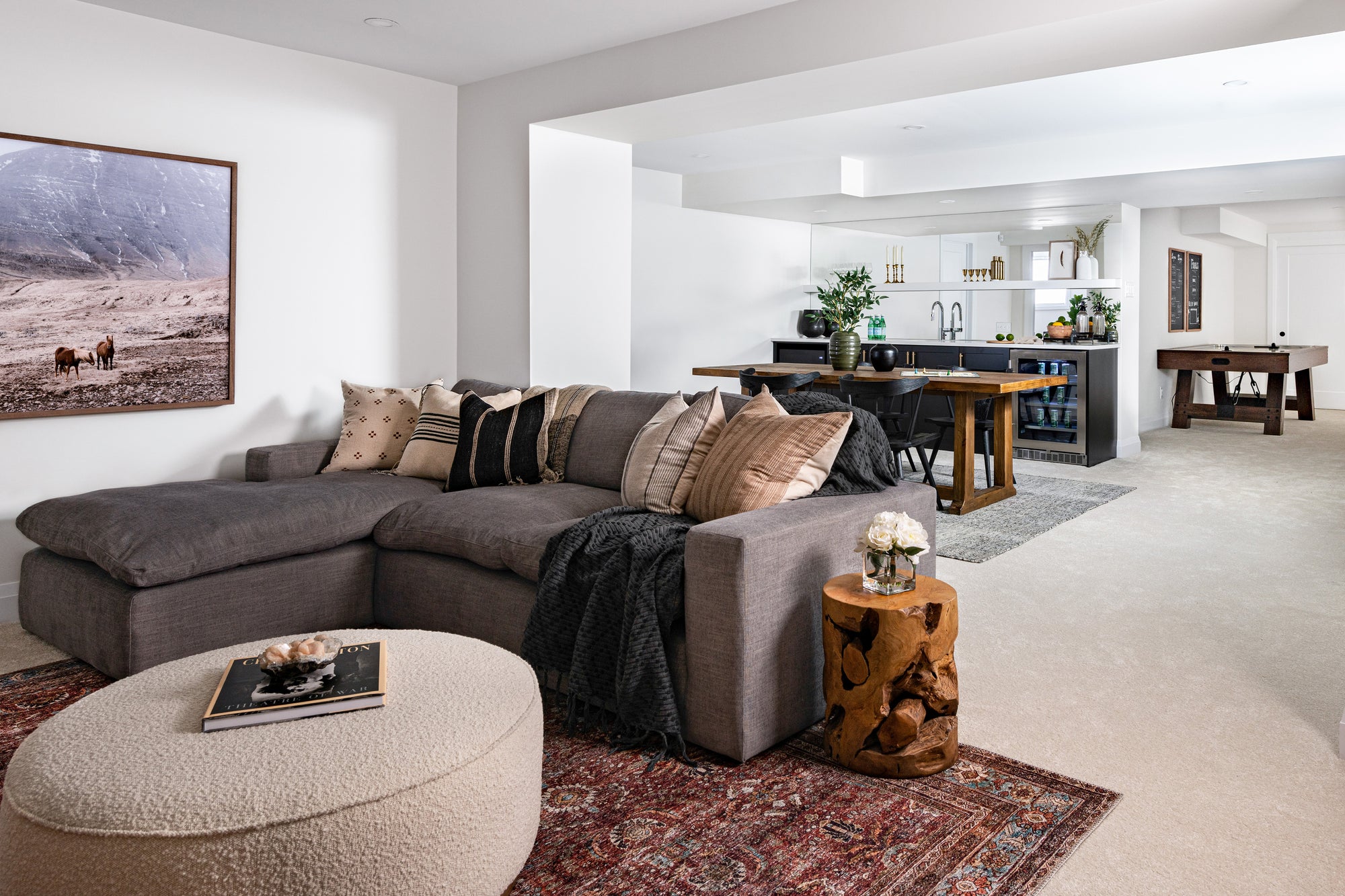
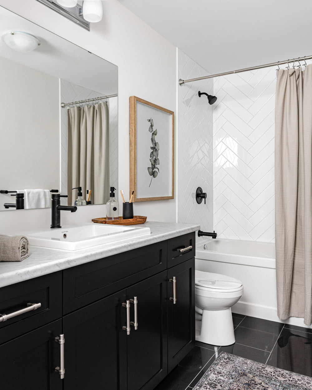
Features: Kitchen, Dining Room, Living Room, Office, Bedrooms, Basement
Entrance
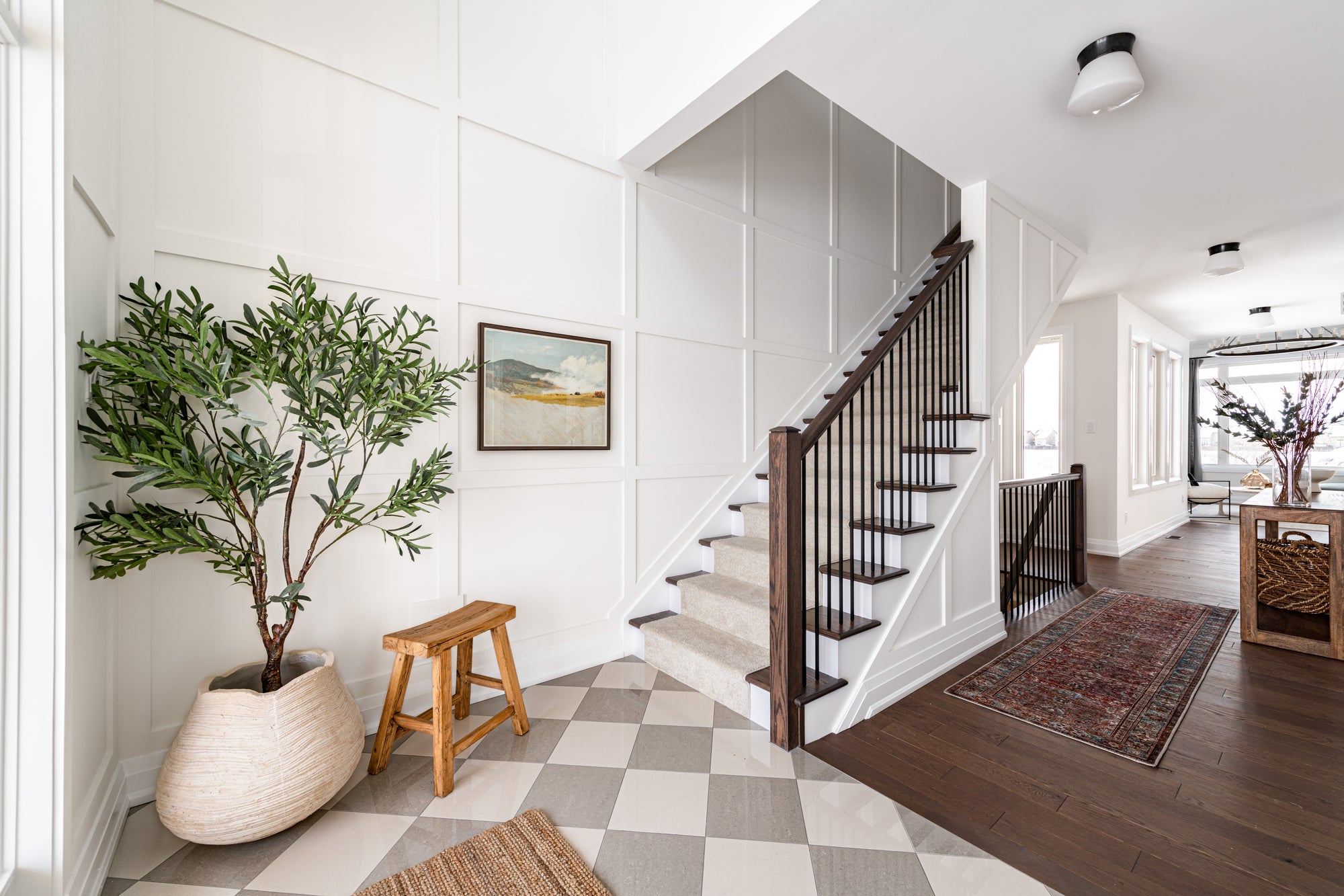
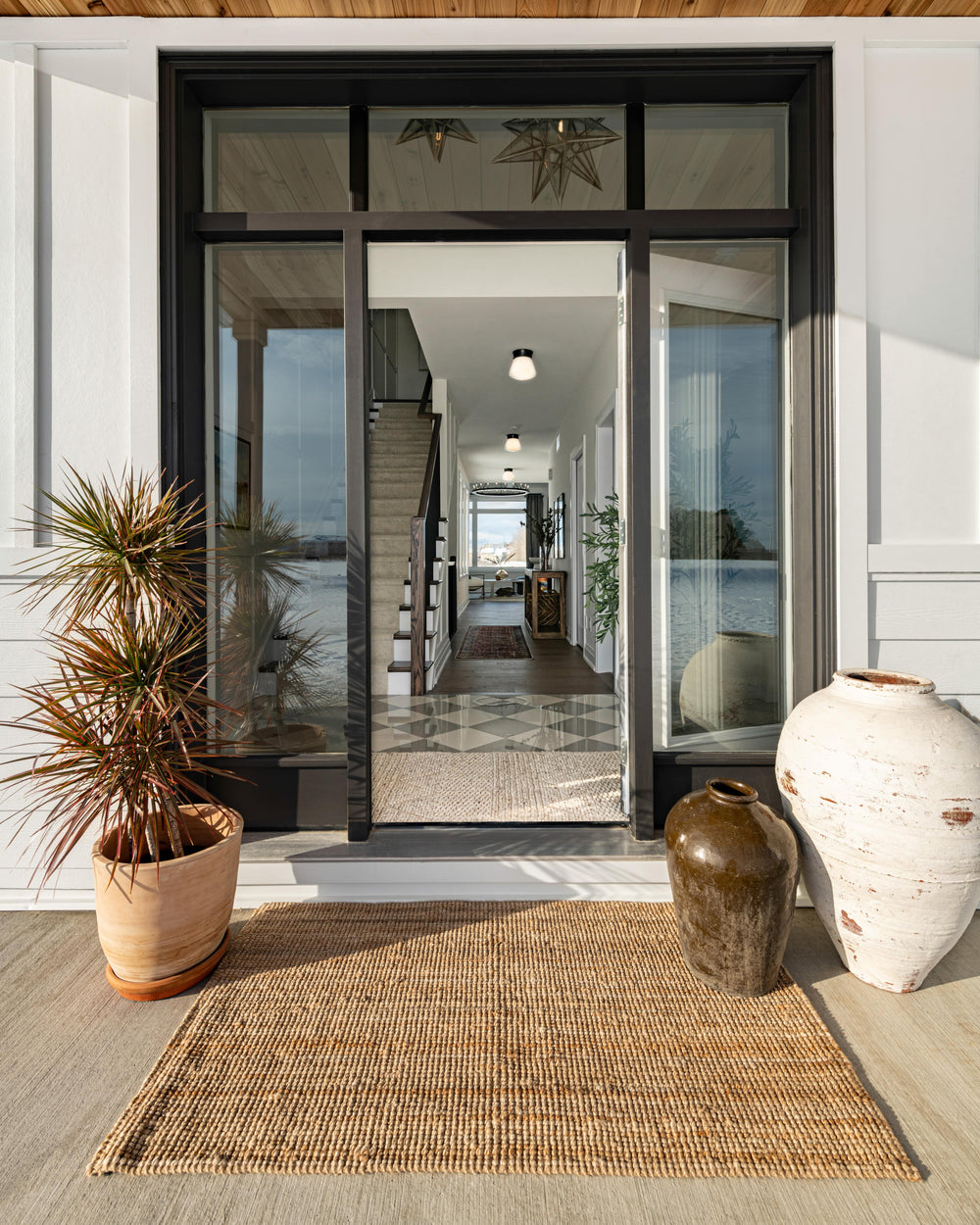
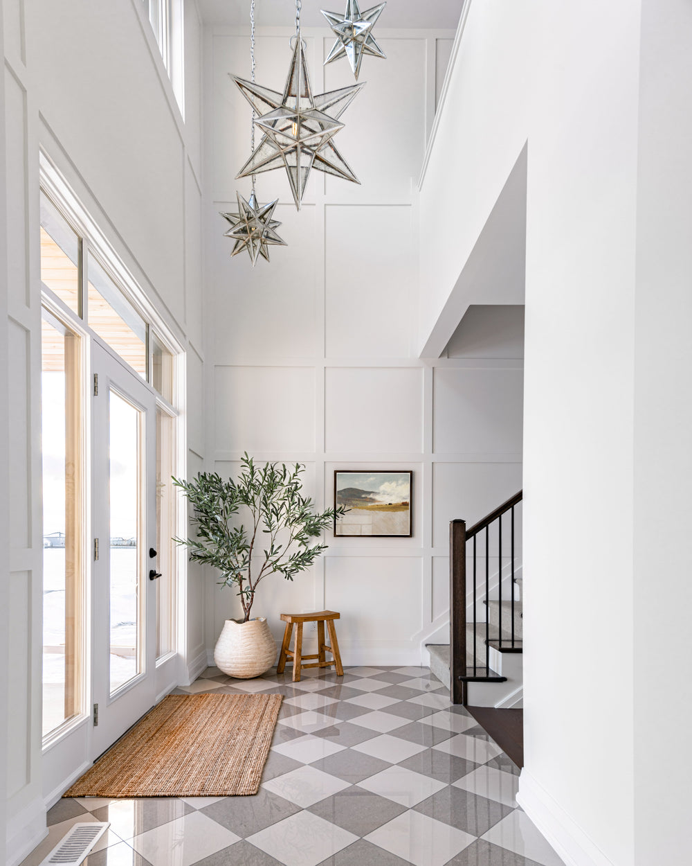
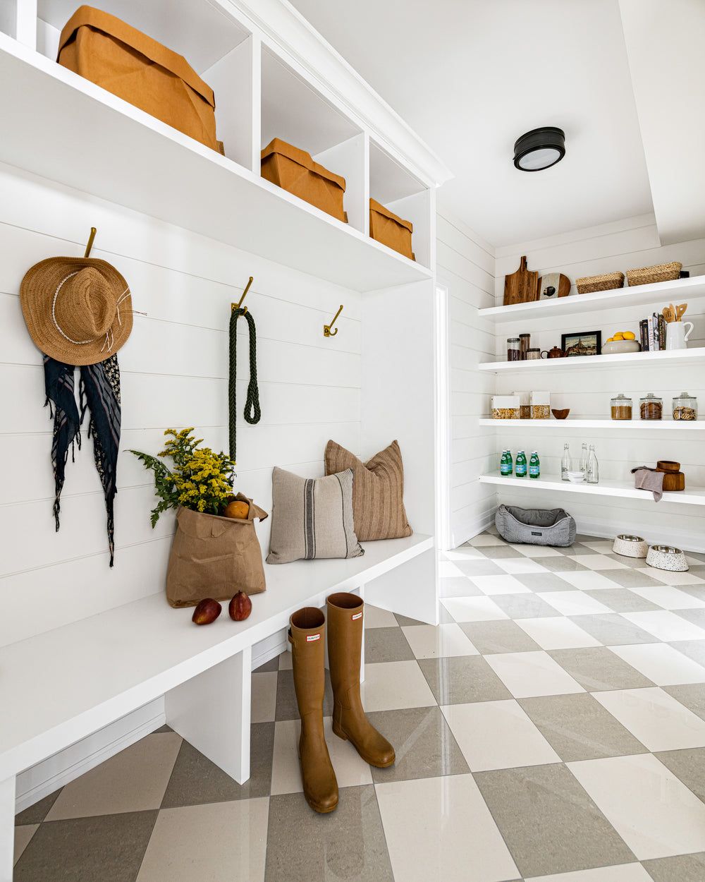
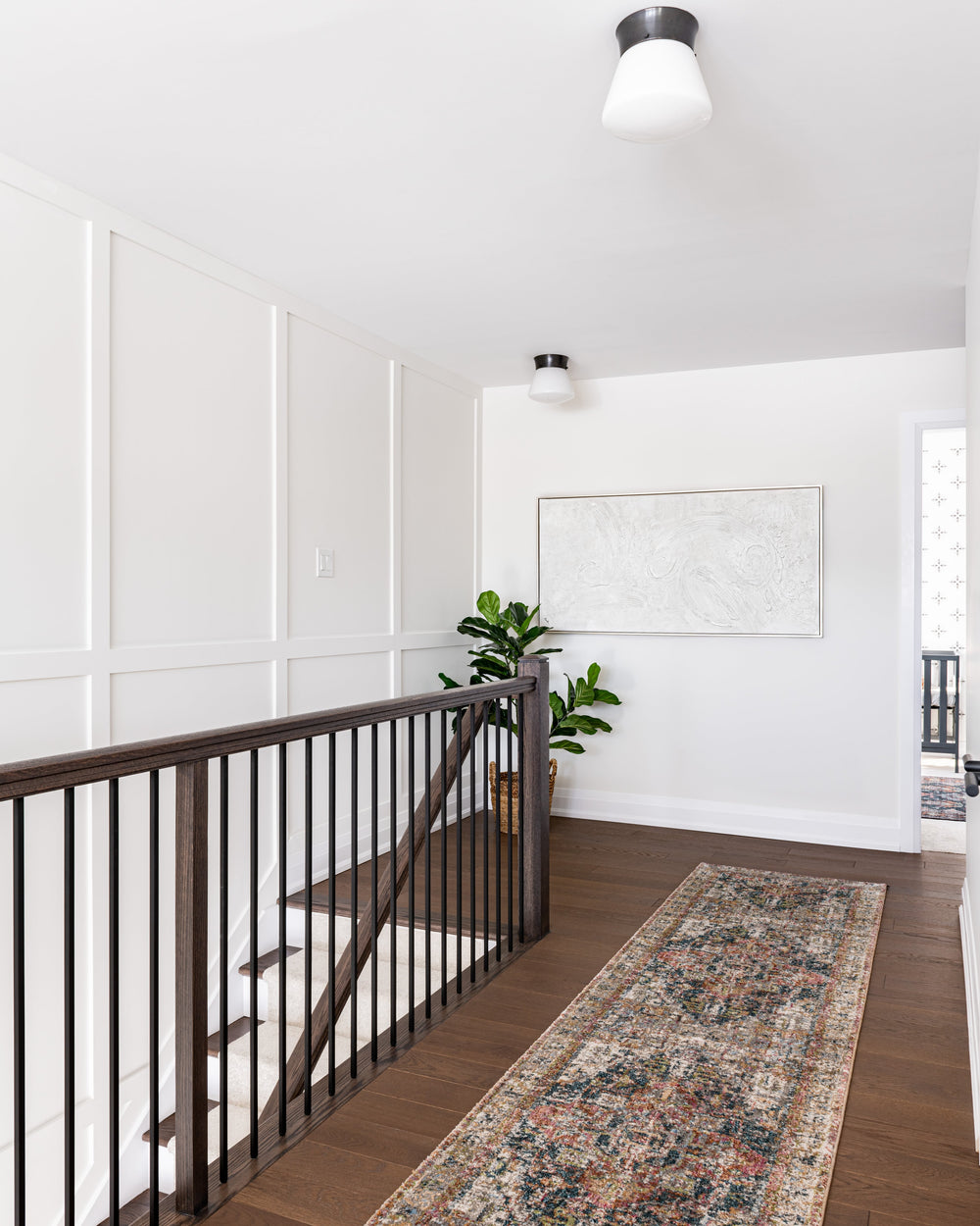
The double-height entrance is bright and spacious and deserved lots of attention! We designed full-wall wainscotting on the stairwell wall, which continues down to the basement, and on the wall surrounding the entry door. For the floor, we loved the idea of a checkered tile installation, but found that the typical black and white palette would be too contrasting and distracting. We selected a creamy white tile and soft grey tile instead, and are so happy with our decision. This tile colour combination and pattern create a soft and neutral visual detail, which is just what we wanted! Lastly, we needed something extra special to hang from the high ceiling. The Moravian Pendant is a classic silhouette; we installed a cluster of three which paired wonderfully with the wall and the floor.
Also Shop: Olive Tree, Hillside Journey
Living Room
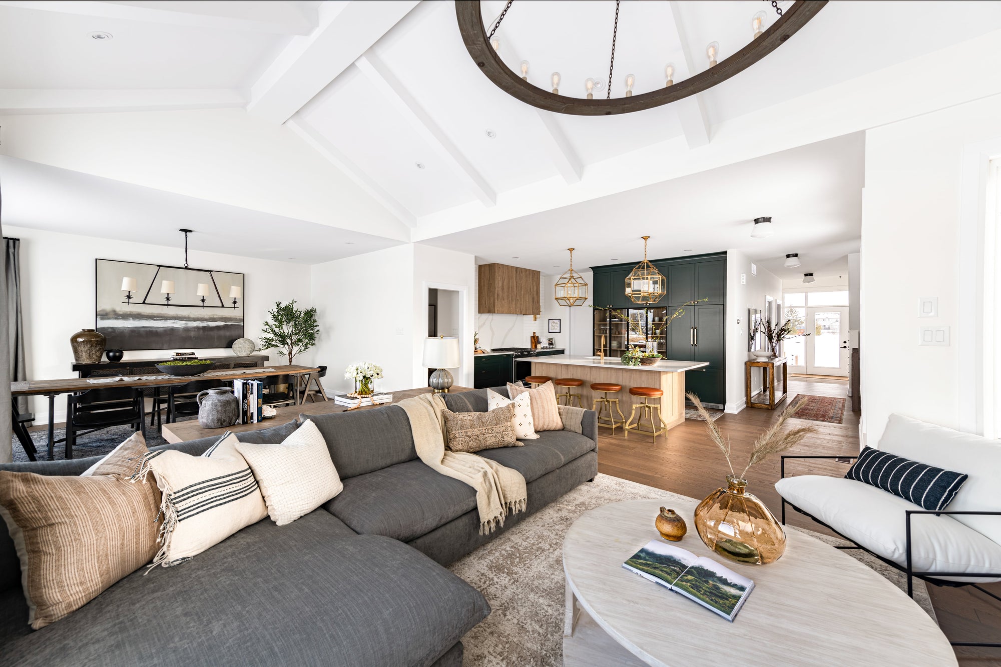
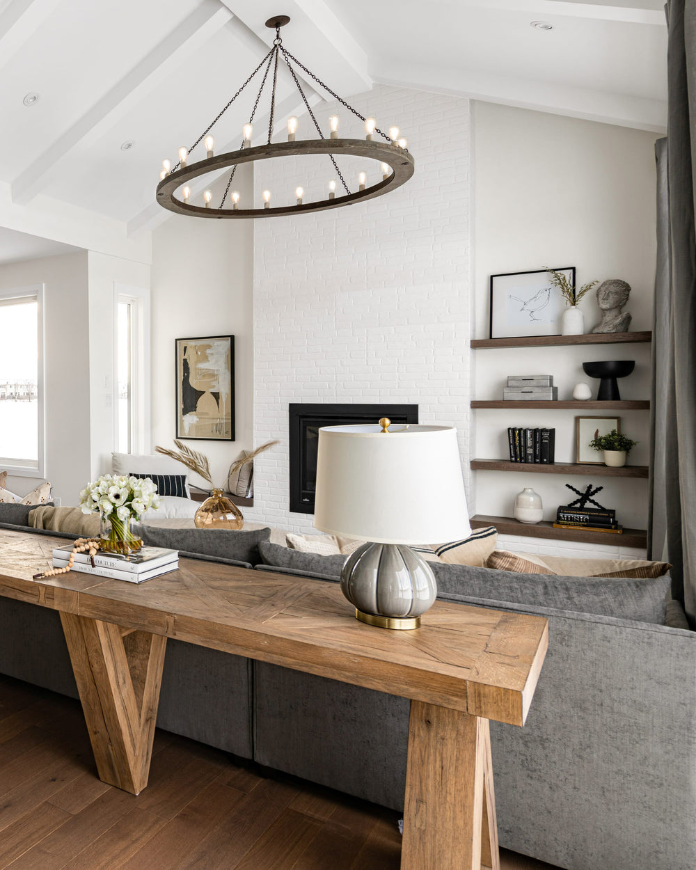
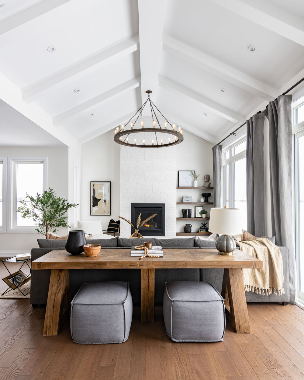
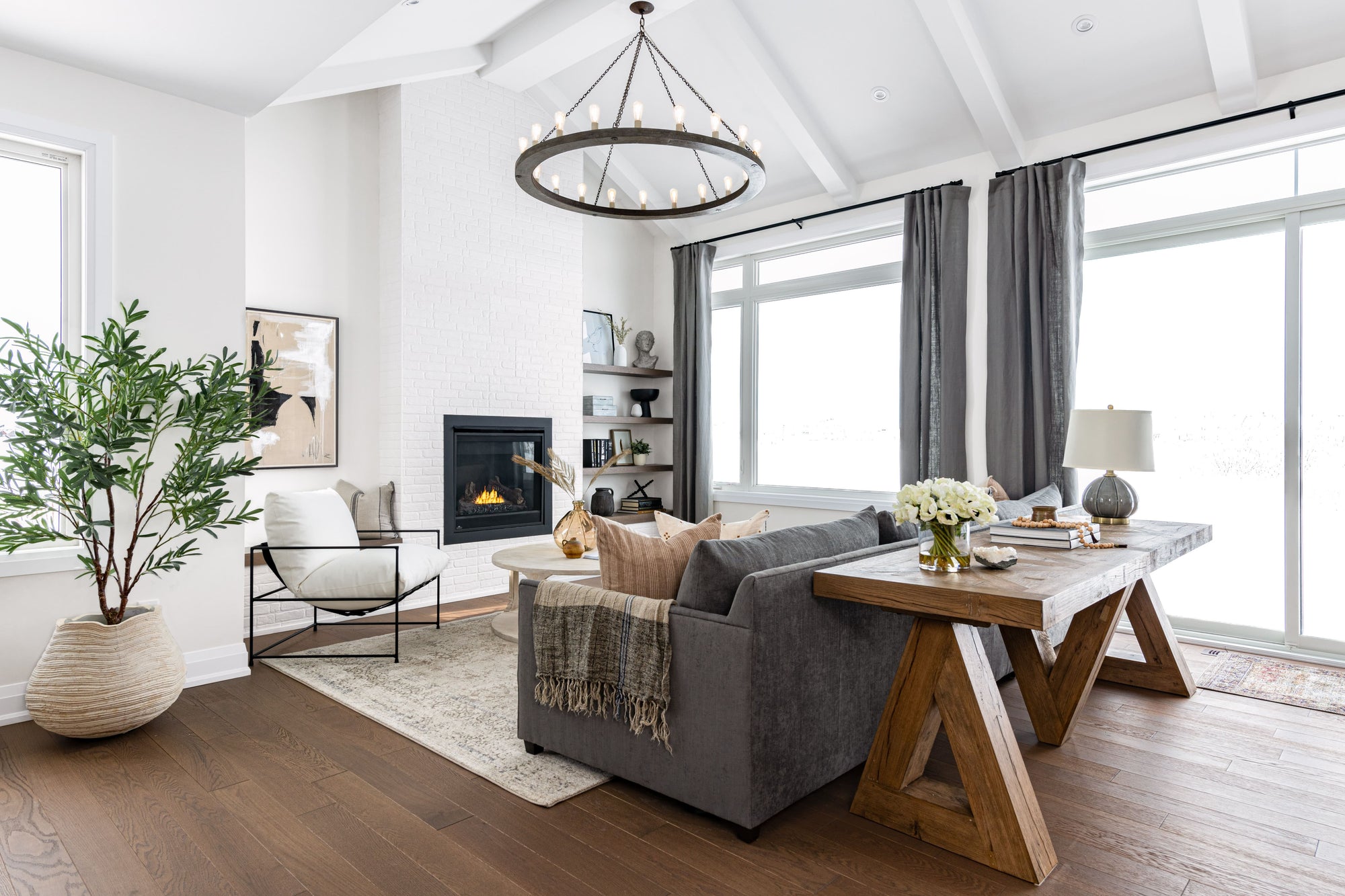
The living room, open to the kitchen and dining room, is delineated by the vaulted ceiling. We added wood beams painted in white to keep the space feeling airy and tall. For ceiling lighting, we dropped the 60” Valencia Chandelier – a classic wagon wheel fixture with exposed bulbs.
The fireplace, aligned with the peak of the ceiling, anchors the space and automatically draws your attention with its grandiosity. So, we decided to keep the covering minimal and textural by using a brick finish in white. We designed asymmetrical millwork around it, creating practical shelving on one side, and additional seating with a bench on the other. The large windows are softened with some flowy, grey linen drapes - the perfect finishing touch!
Kitchen
We are generally humble people, but when it comes to this kitchen, we can't help but think, "Heck, we did good!"
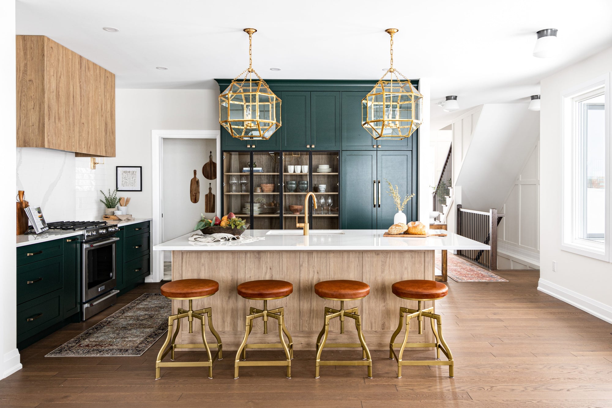
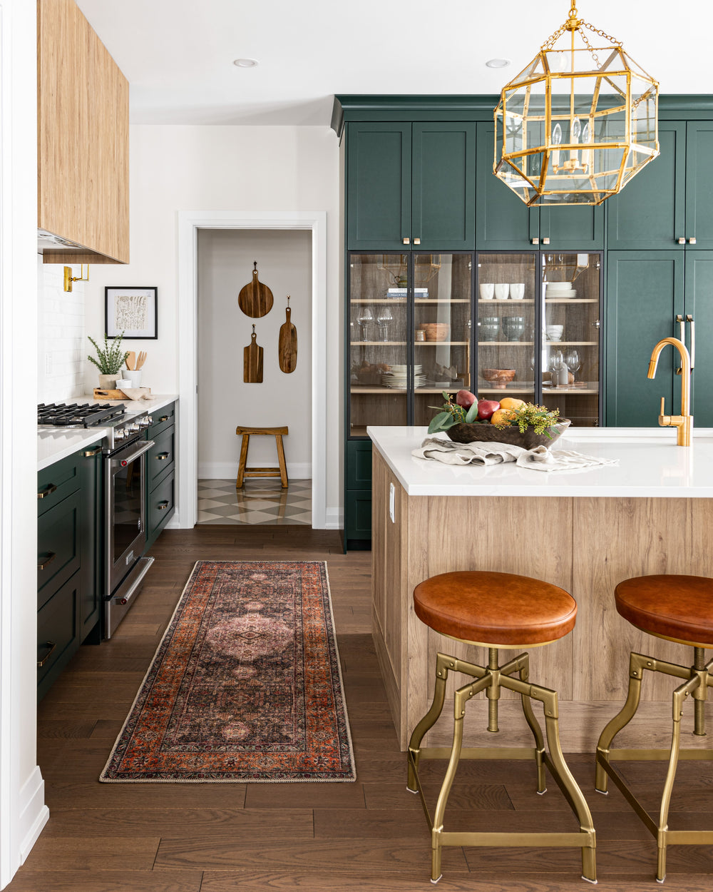
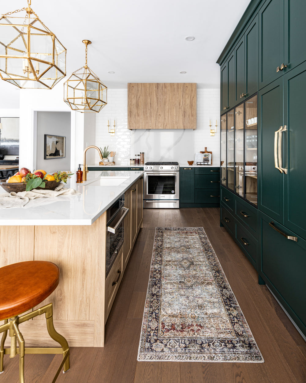
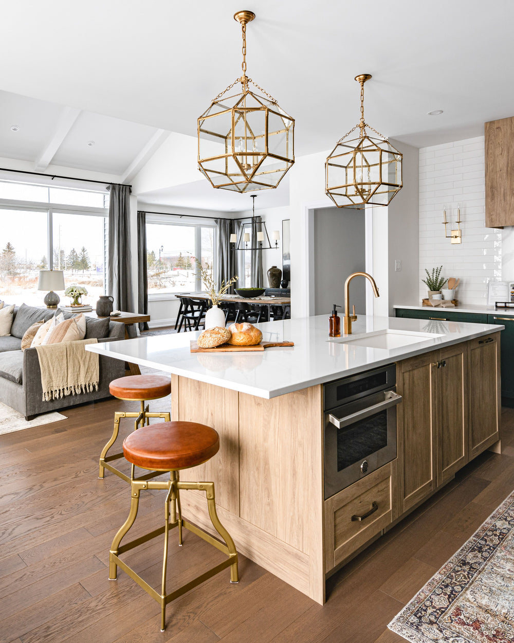
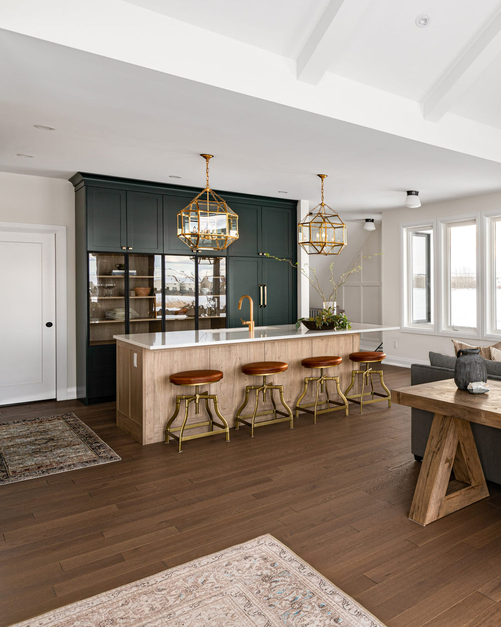
Our goal was to create a boutique-style kitchen that blended traditional and modern styles. We started by selecting a deep green cabinet colour (Essex Green By Benjamin Moore) and everything fell into place from there!
This home has a walk-in pantry, so we could afford to lose the upper cabinets on the stove wall. Doing this allowed us to create a feature wall by including a 60” hood, mixing white subway tile and marble backsplashes, and some decorative wall sconces for a touch of glam. To balance the airy stove wall, we needed something voluminous on the adjacent wall. We panelled the refrigerator for a seamless look, and went with floor-to-ceiling cabinets.
To break up the deep cabinet colour, we designed some thin, black metal glass doors for one of the cabinets and used the light wood finish found on the island and hood fan on the interior to create contrast. We cannot discuss this kitchen without mentioning the pendants! Two medium Morris Lanterns in the gilded iron finish tie the space together and their geometric silhouette perfectly blends the traditional and modern details featured in the kitchen.
Also Shop: Right Angle Double Sconce
Master Bedroom
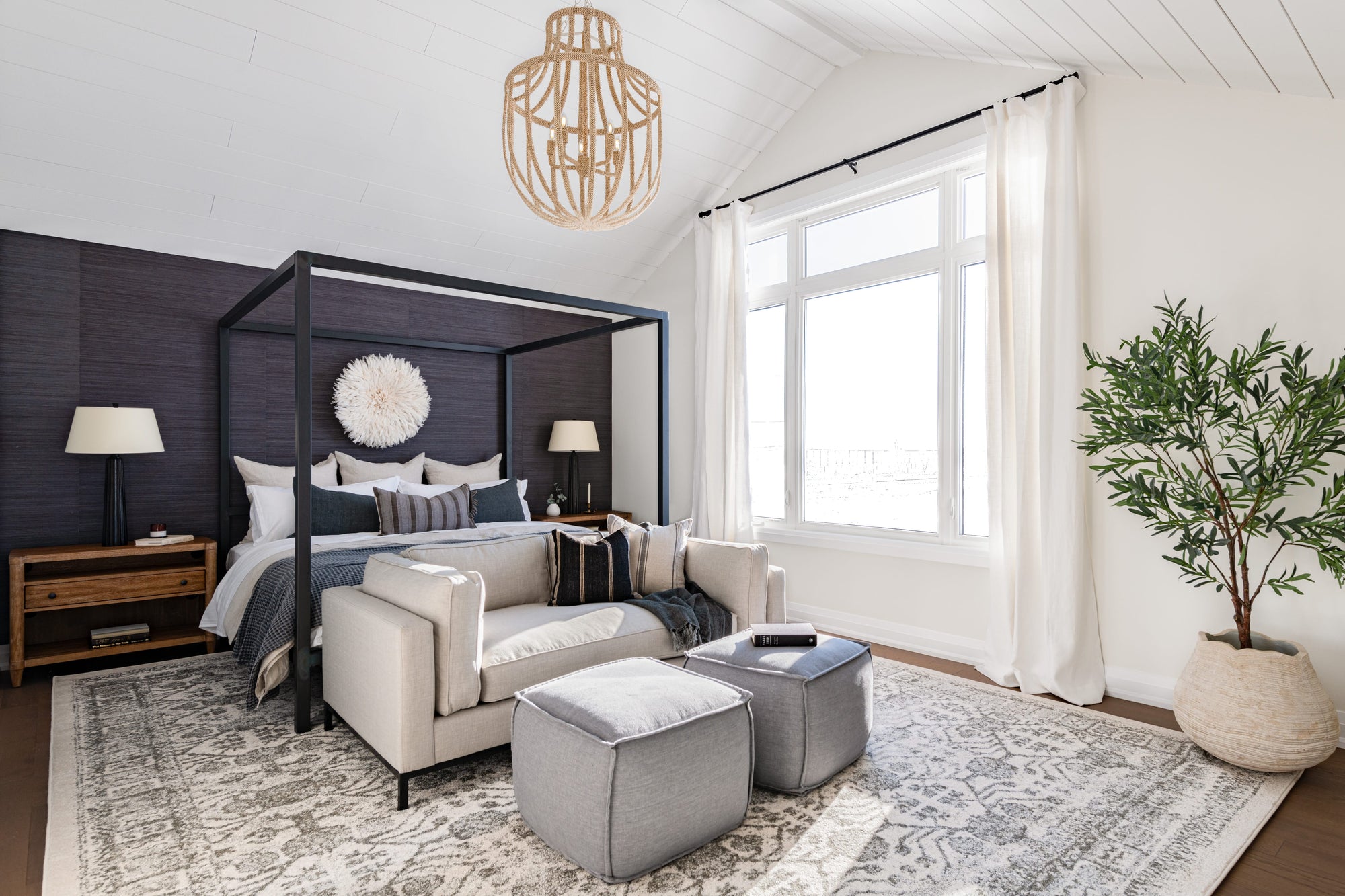
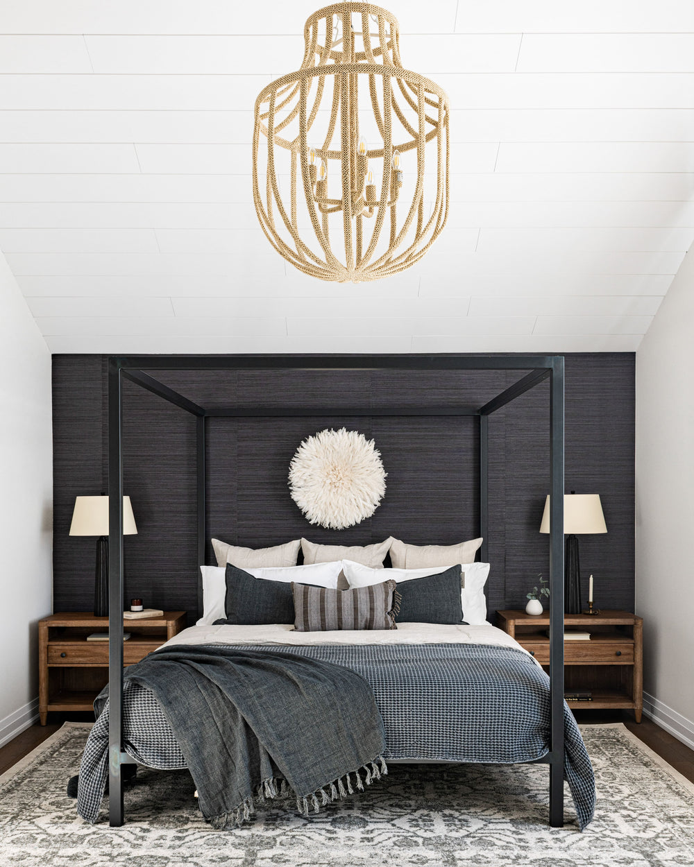
The master bedroom is super spacious, with a large window and a vaulted ceiling. The first thing we decided to do was to clad the ceiling with shiplap for a little visual texture.
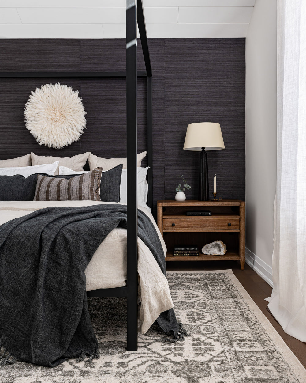
We knew from the start that this room needed a four-poster bed to give it the grandeur it deserves. We wanted the room to be light, yet warm and cozy, so we added the indigo grasscloth wallpaper and found a large, plush rug that covers the majority of the floor. We chose the Lolita Chandelier to hang centred in the room. This chandelier has a classic silhouette, but the fact that it is covered with tiny woven coco beads makes it so uniquely textural.
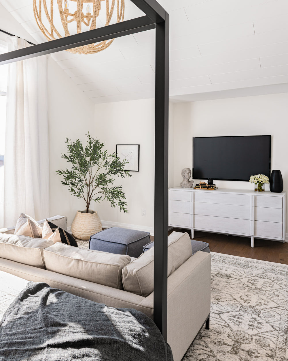
One of our favourite parts of this bedroom is the fact that it has a lounge area, creating the perfect suite to relax and get away from life's hustle and bustle.
Also Shop: Fluted Spire Table Lamp
Wall Paint Colour Throughout: “Steam” AF-15, Benjamin Moore
Trim, Baseboard and Ceiling Colour: “Chantilly Lace” OC-65, Benjamin Moore
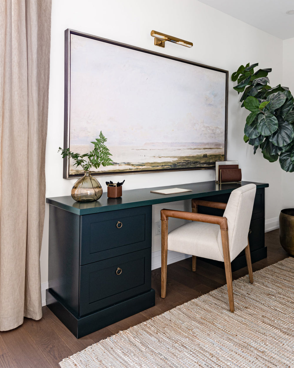
Kitchen Cabinet and Office Desk Colour: “Essex Green” HC-188, Benjamin Moore


