Project Good Vibes House
This spacious home in the east end of Ottawa was a blank space for the West of Main design team to work their magic. We fully furnished and renovated this home to align with our young clients’ taste and lifestyle. They love the vibe of the Hamptons, which we embodied through natural materials, woven details, and beachy colour palettes.
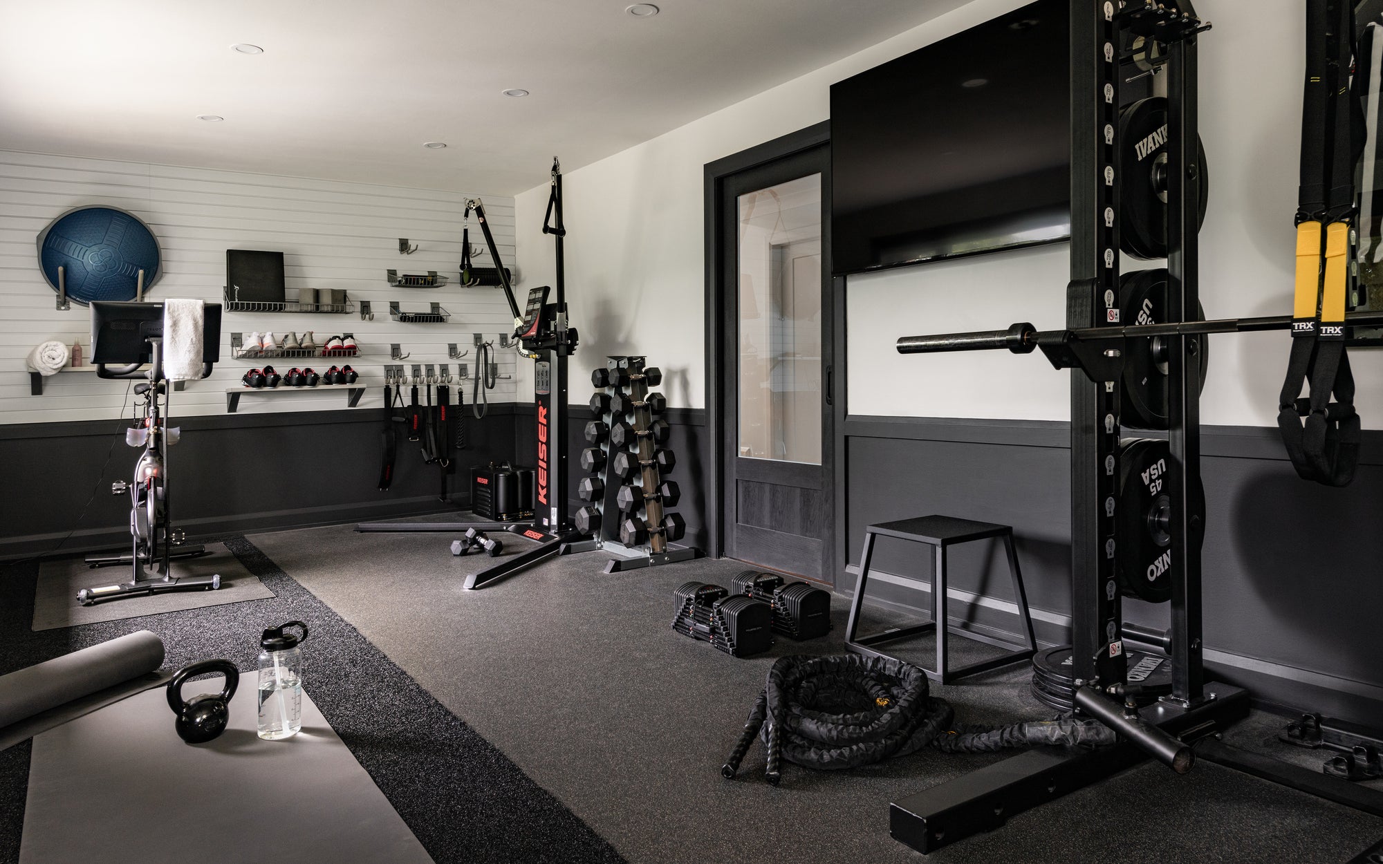
Features Entry, Dining Room, Formal Living Room, Family Room, Breakfast Nook, Powder Room, Kitchen, 2nd Floor Hallway, Guest Bedrooms, Gym and Master Suite

Entry
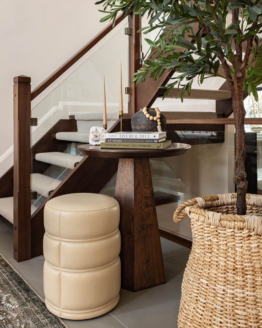
The center staircase in dark mahogany wood and glass is the main focal point as you enter the home. To draw the eyes up, we chose this glamorous four-tiered Clarice Chandelier with brass accents, delicate lucite curved arms, and linen shades. We had a custom walnut pedestal table made to perfectly fit the corner under the stairs, which was crafted by a local furniture designer. Under the table, we layered a small leather ottoman to have a seat if needed while putting on your shoes. An 8' Olive Tree adds some much-needed organic lines against the angular stairs. To fill the landing, we added the Layla Antique / Moss Rug which softens the floor tile, but is also durable for when people walk in with shoes on.
Also Shop: Vases
Dining Room
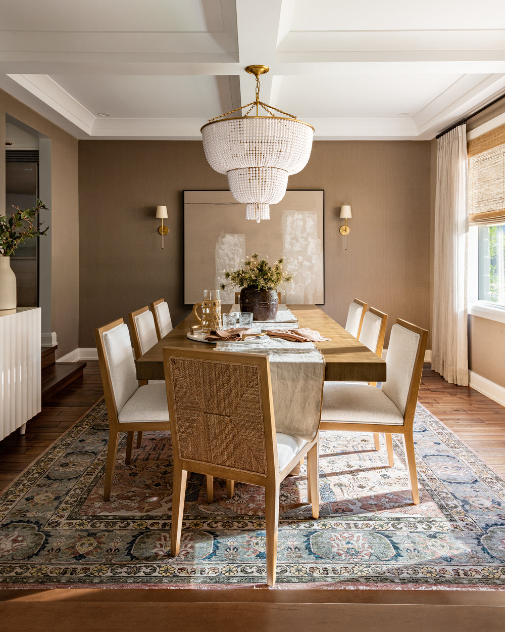
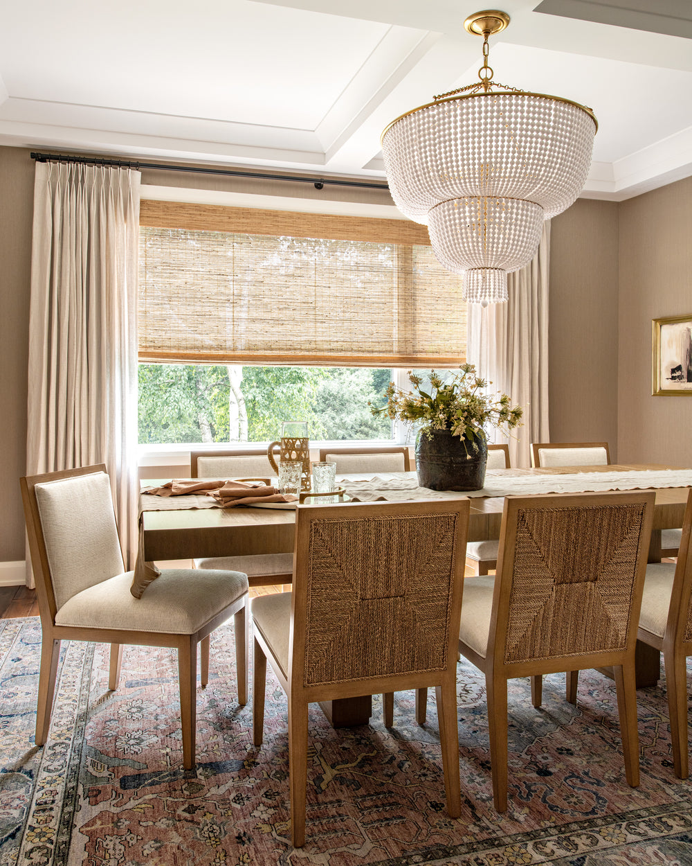
Milk chocolate silk grasscloth wallpaper adorns the walls in the sunken dining room off of the entrance. We wanted to create a luxurious, moody space here for our clients to host some epic dinner parties - and they have definitely made good use of it so far! Two Camille Wall Sconces tie in the elements of brass and lucite from the entry chandelier, which are placed on either side of the Muted Thoughts II abstract artwork. Paired with these sconces is a stunning beaded Jacqueline Two Tier Chandelier, giving us major Hamptons beach vibes.
The dining table seats eight or more of the Loreto Dining Chairs, which look oh-so-good from all angles, but especially from the back with their natural rope pattern inlay. Under the dining set is a beautiful hand-woven area rug, with taupe and terracotta tones to bring everything together.
Also Shop: Graybank Mirror
Formal Living Room
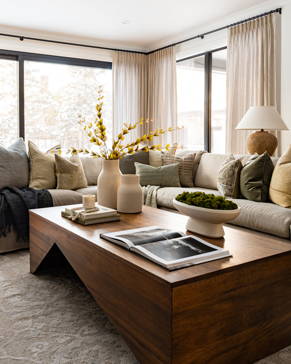
Drapery and window coverings play a large role in the design of this home. Large windows are great, but privacy and light control are key factors in making a space feel comfortable. In all spaces, we added woven roman shades with linen drapery, making the large windows feel finished and tailored.
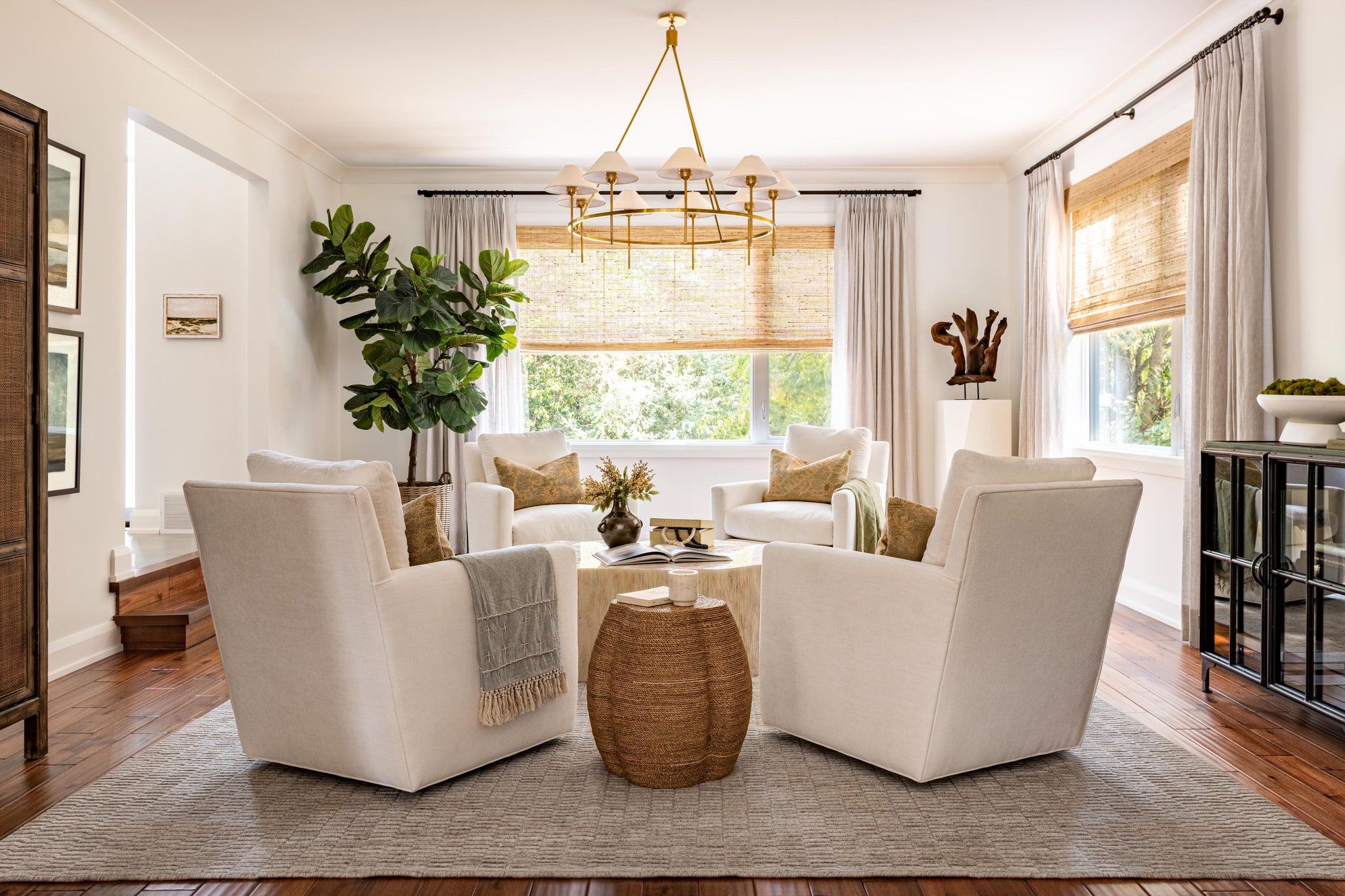
The home has so many different areas for seating and relaxing, so we wanted to make this space feel unique by having four chairs facing each other to create a more formal use of space. Here, the swivel chairs from the WoM Collection are upholstered in a super durable Crypton fabric, making the white fabric less intimidating to sit on. The Hadley Area Rug is quite neutral in colour, but it has a high-low pile height that adds so much texture underfoot. The sculptural coffee table is inspired by a tree trunk and made from fossilized clam shells – yes, you heard that right! All of the ivory and cream tones in this room make it a dreamy spot to entertain your guests.
What entertaining space would be complete without a bar? The Lisle Bar Cabinet has rattan bi-fold doors with rope handles. But on the inside, this cabinet is packed with everything you need for hosting including stemware racks, wine shelves, and pull-out work surfaces.
We did not neglect the corners of this room, which are an important feature of this design. In one corner, a real ficus moclame tree adds some greenery, and in the opposite corner, we added the Princeton Facet Pedestal with a one-of-a-kind wooden sculpture on top.
Also Shop: Hackney Chandelier, Outlands Artwork
Family Room
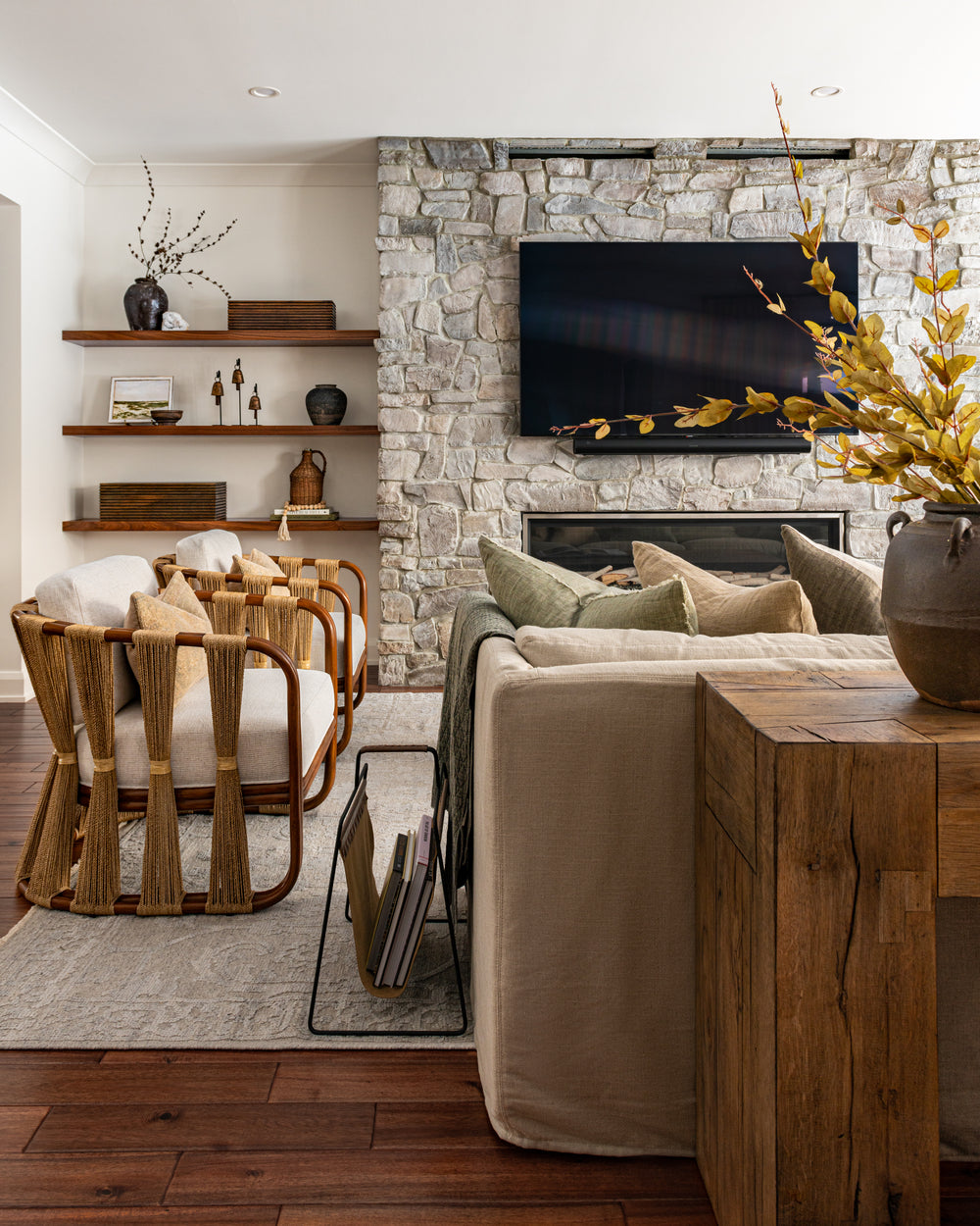
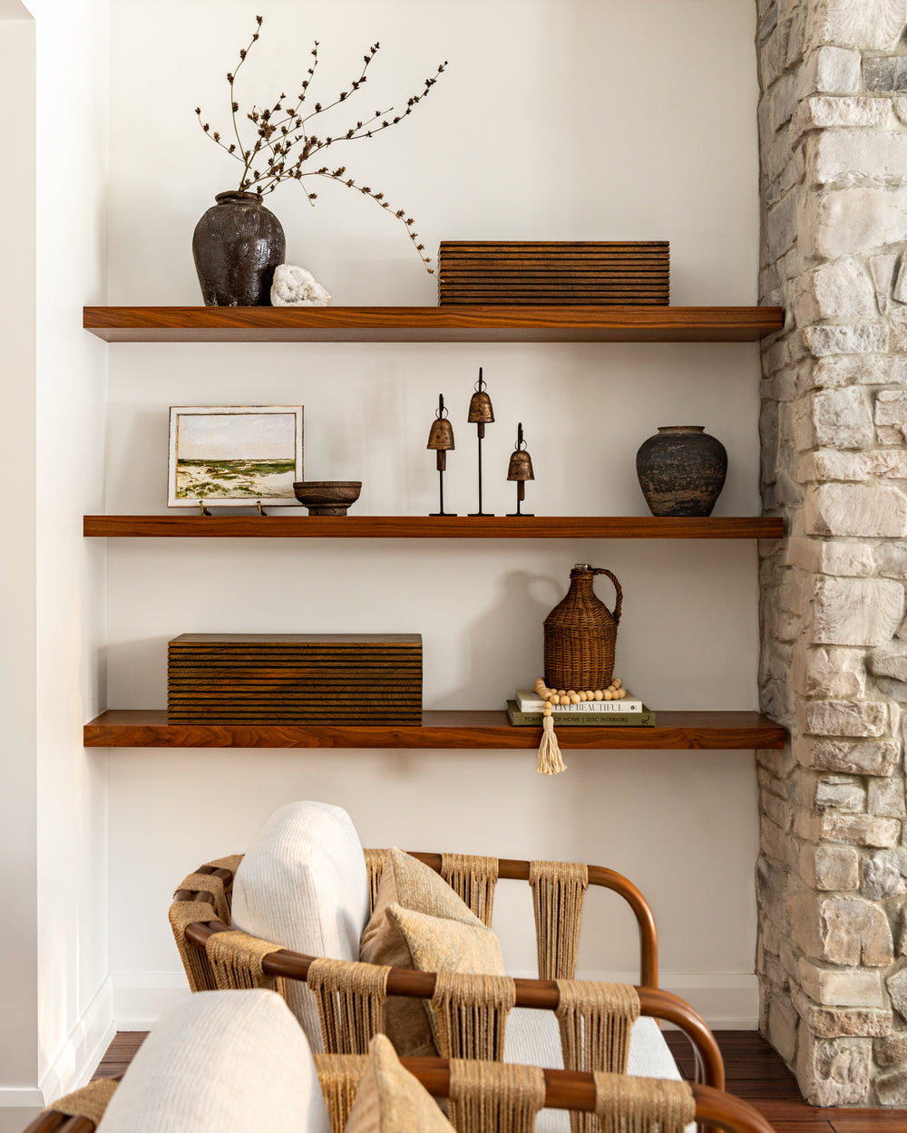
The existing large stone fireplace anchors this room and creates such a cozy feeling. It was a bit dark for our client’s taste, so we applied a custom white wash onto the stone to brighten it up. This was a fairly simple and easy update to make! To create additional interest on this wall, we added asymmetrical walnut floating shelves beside the fireplace for some minimal accessories. We love how these shelves tie in the rich wood flooring throughout the home.
This very long and narrow space required a custom-length sectional, which we had made in a neutral beige Crypton fabric from the WoM Collection. The rectangular walnut Brookbury Coffee Table fits the shape of the space nicely and has some beautiful sculptural elements.
This room is just off of the formal living room and kitchen areas, which we didn’t want to visually close off, so we added a pair of lounge chairs with gorgeous rattan frames and alpaca rope on the backs for high impact. They tie in so nicely to the other rope details in the dining and breakfast nook.
Also Shop: Tilmi Accent Tables
Breakfast Nook
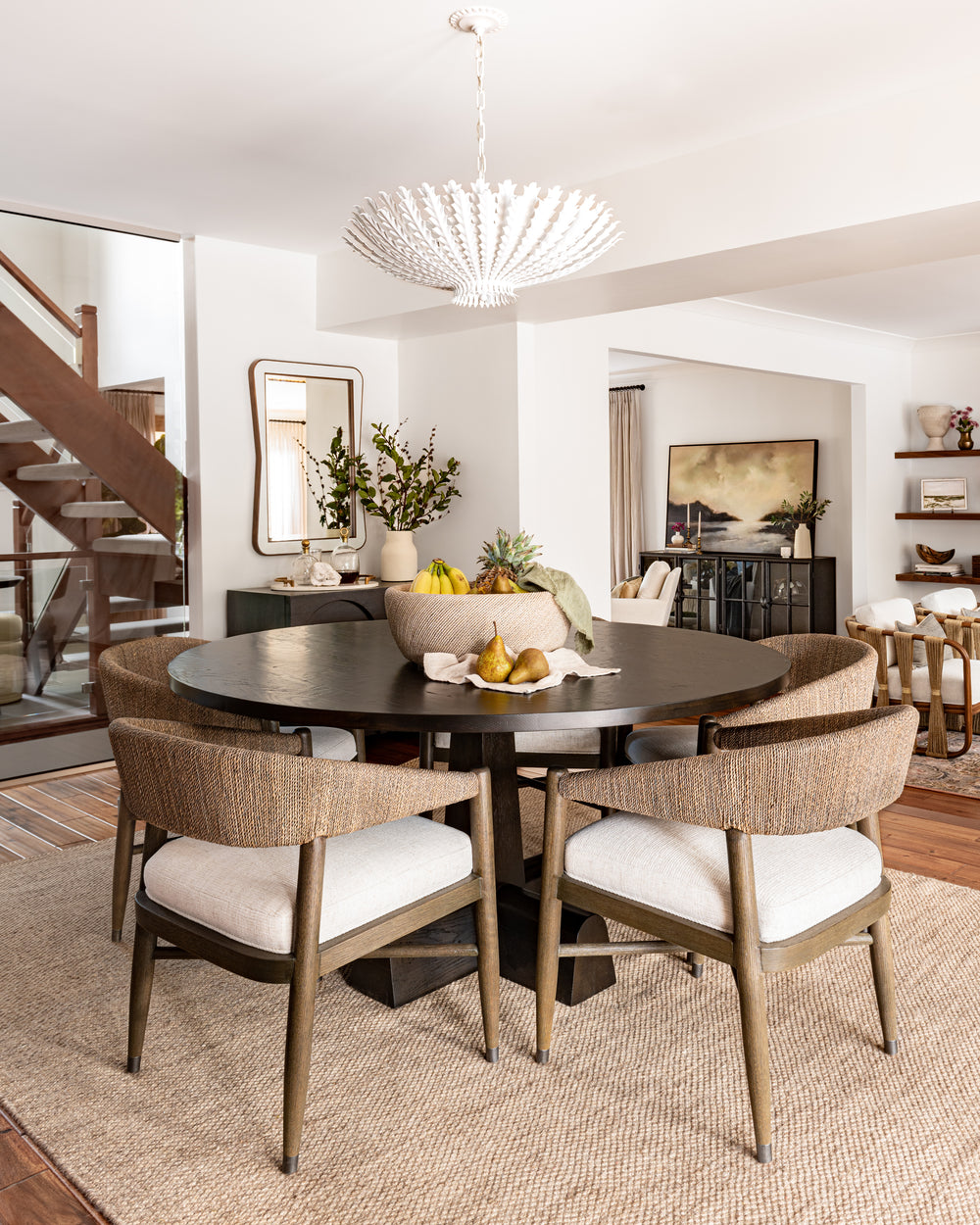
Nestled between the kitchen and family room is the breakfast nook, which has a 360-degree view of the entire main floor. Right off of the patio doors to the backyard, this is the perfect spot for coffee in the morning, or even a games night with friends. The Hampton Chandelier (how appropriately named) is centred above the large dining table. We liked how the white plaster finish would not take be too visually distracting, especially if watching the game on the TV while cooking in the kitchen. Unlike the dining room, we opted for pieces with darker wood finishes for a bit of drama. The round and richly coloured dining table pairs beautifully with the six of the Casma Dining Chairs which are also hand-wrapped in rope.
In this design, we wanted to make sure there were no neglected corners. In the breakfast nook, we added this petite sideboard with the mirror above to act as a morning bar or servery for entertaining.
Powder Room
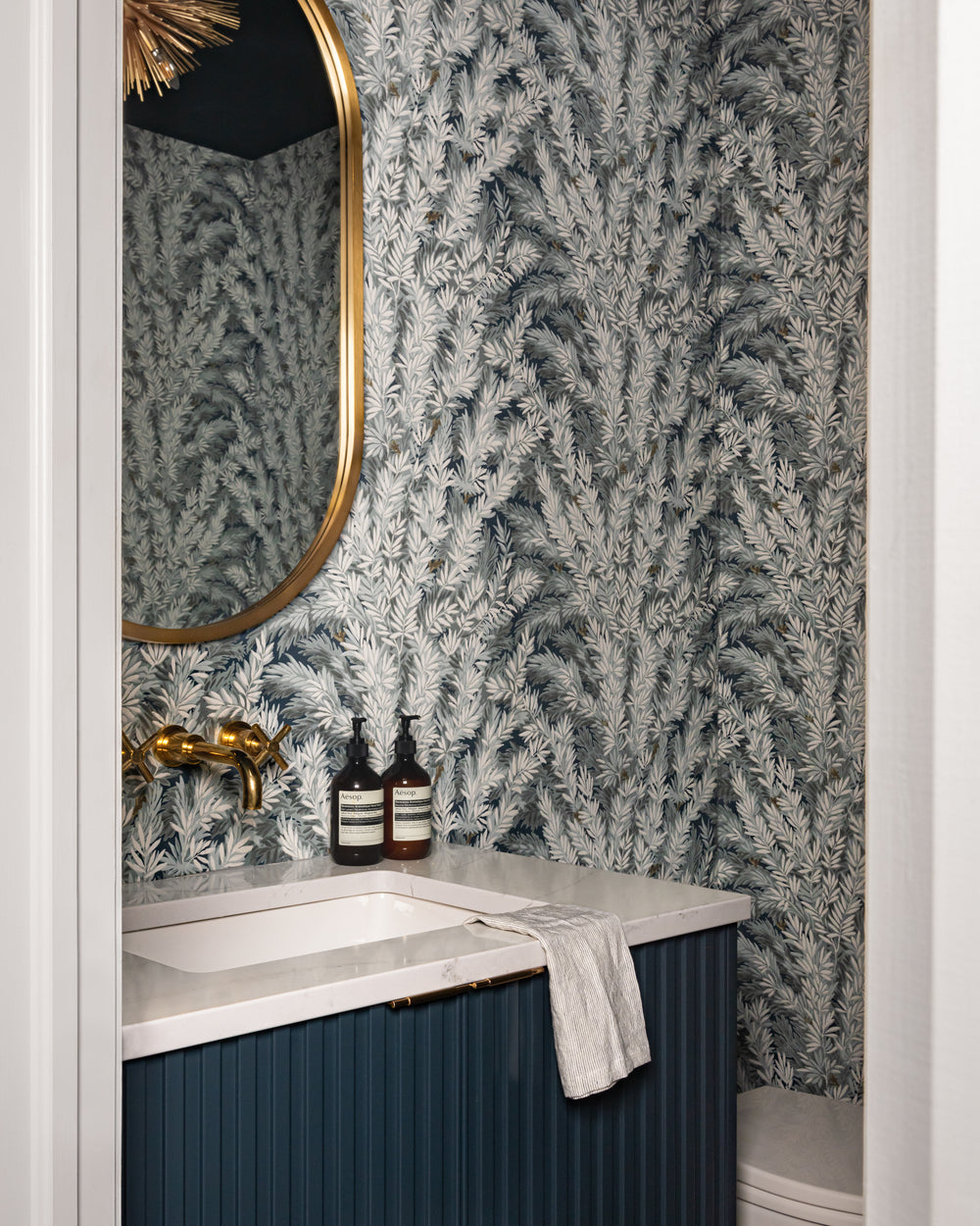
At West of Main, we're huge fans of bold powder rooms. Powder rooms are such a great opportunity to give a small space a big personality! The foliage-patterned Florencecourt Wallpaper from Cole & Sons is inspired by the yew trees in the British Isles. The variation of charcoals, teals, and ivory creates an almost three-dimensional effect, which is where we pulled the custom vanity colour for its painted finish.
Above the new custom sink vanity, we chose the Almere Mirror in Brass paired with the gild Strada Flush Mount on the ceiling. Not to be forgotten is the ‘fifth wall’ – the ceiling! We also painted it in Stonecutter by Benjamin Moore to match the vanity.
Kitchen
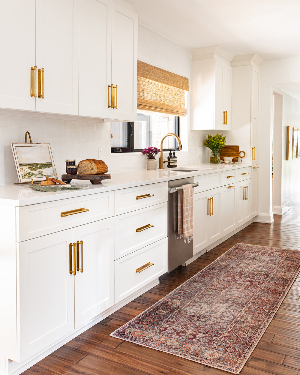
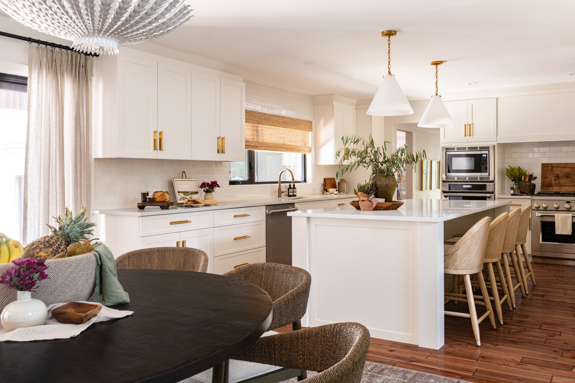
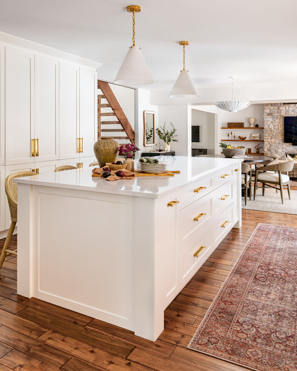
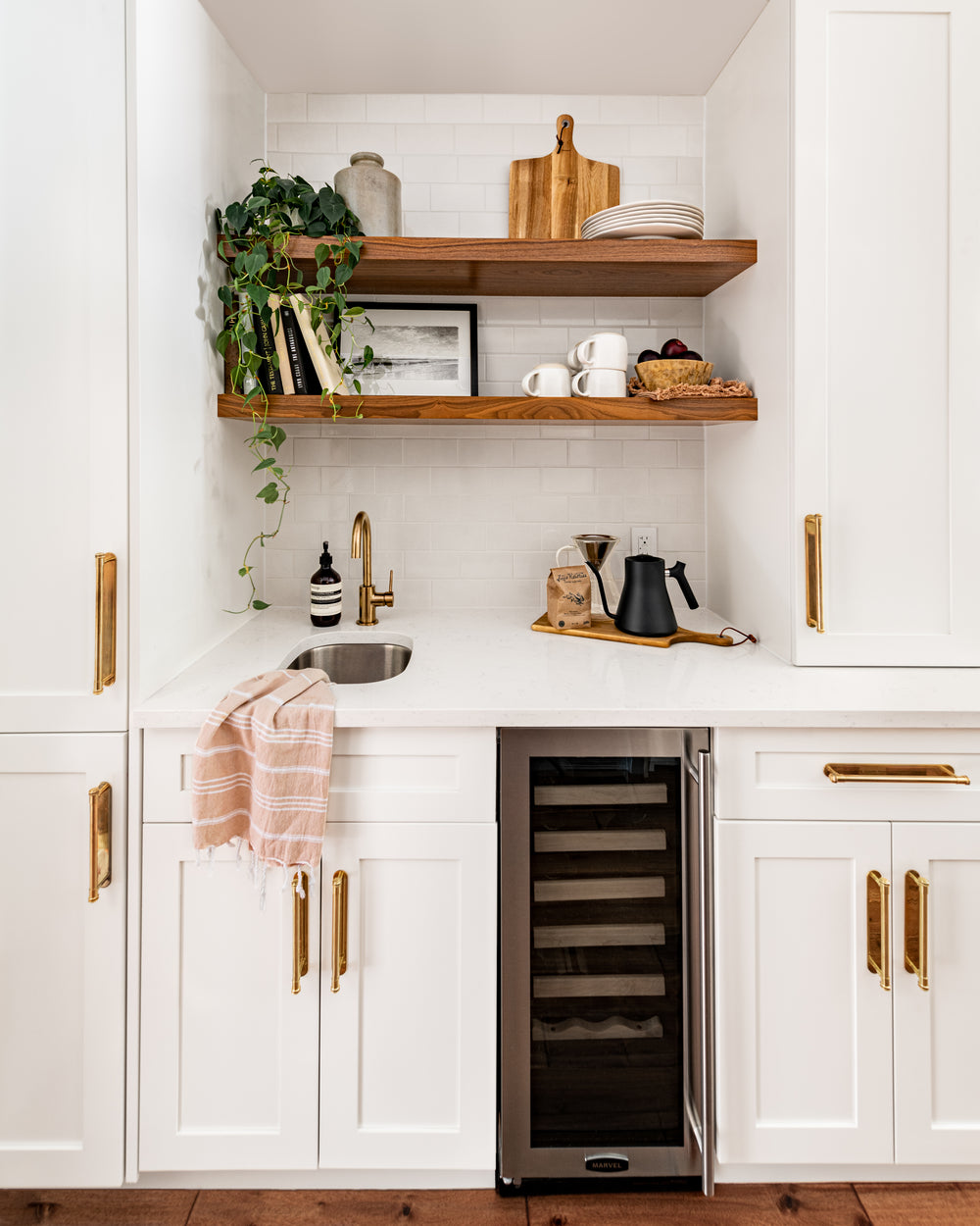
This kitchen was mainly existing, but some of the components like the pantry and island were in a dark wood colour, which our clients didn’t love. To keep it light, bright, and coastal, we refaced these components to match the other white-painted door fronts, then swapped out all of the dated hardware for unlacquered brass. We also changed the backsplash everywhere to a timeless white crackled subway tile. What an impact these small changes made! All that was left to do was swap out the pendants for two Katie Conical Pendant, add four vintage white wood counter stools, and finish with a woven roman shade – all sourced via West Of Main Shoppe for our clients.
Also Shop: Layla Cinnamon / Sage Runner
2nd Floor Hallway
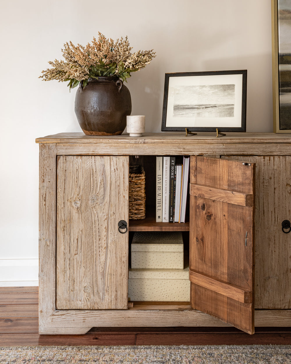
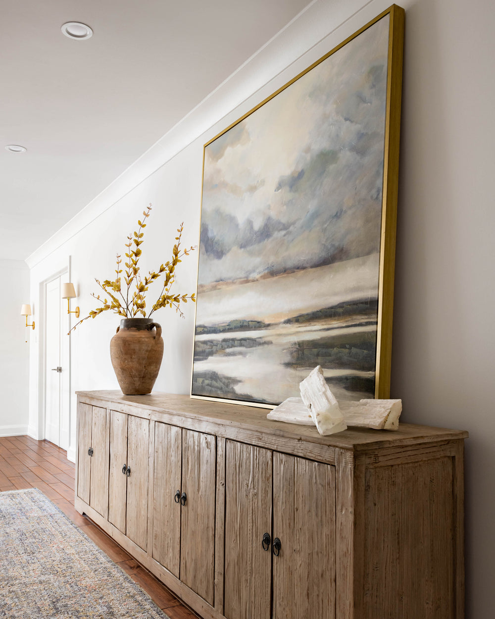
Before jumping into the hallway selections, it is important to note the change in layout during the renovation to accompany the new walk-in closet. There used to be a door to another guest bedroom from the hallway, and by removing it, we were left with a very long blank wall. To create an impact, we sourced the Sunnybank Sideboard from our Shoppe for ample storage, with an oversized landscape print leaning off-centre on top of it. We love how this vignette brings you down the long corridor to the guest bedrooms.
Also Shop: Crystal, Vase, Runner
Guest Bedroom #1
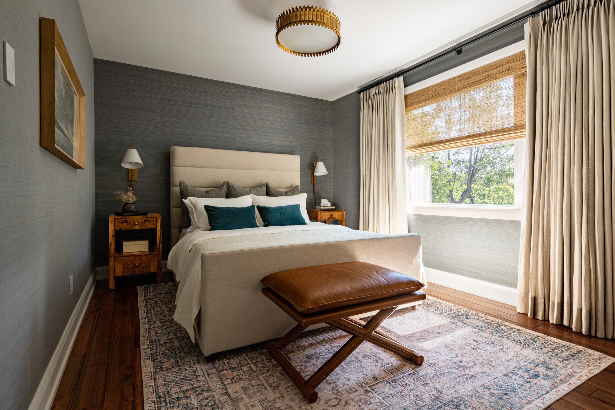
Moody grasscloth wallpaper on all walls envelops you in this guest bedroom. To balance the darker walls, we added the light and bright Jules Area Rug that pulls from the teal undertone of the wallpaper. We went with simple textural cream bedding on the upholstered Mirabel Bed that showcases a high tufted headboard. On either side of the bed, we selected these gorgeous burled wood nightstands that add so much warmth. To save surface area, we opted for wall-mounted, plug-in sconces, so no electrical work is needed. The repeated drapery and window treatments keep this space cohesive with the rest of the home.
Guest Bedroom #2
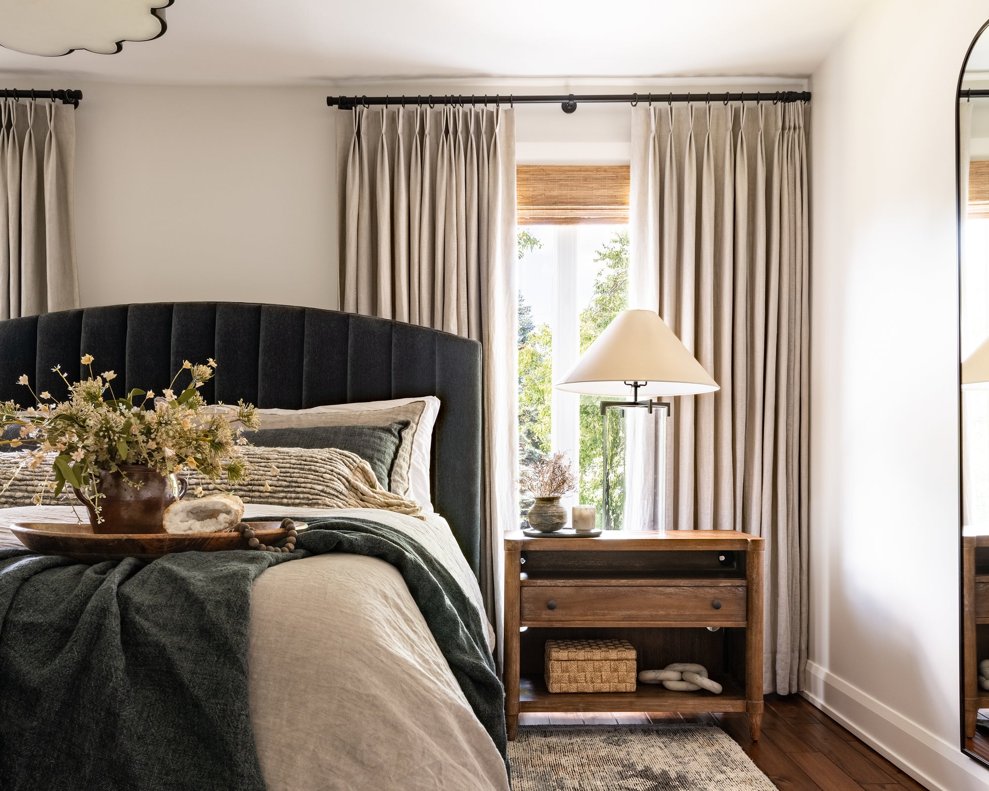
Unlike the first guest bedroom, we kept the walls light and bright, painted in our favourite "Steam" by Benjamin Moore. This room was renovated to be a larger guest bedroom, which allowed us to have two large windows on either side of the king bed. This custom Yorkville Bed was designed through the WoM Collection in a rich navy velvet fabric called ‘Everest Peppercorn’. On either side of the bed, we chose some more rustic wood nightstands, paired with the timeless Brooks Table Lamp in aged iron. Behind the nightstands, the custom linen drapery adds so much interest that there's no need for artwork above the headboard.
To ground the large furniture pieces we selected, we selected a hand-knotted rug that has a dynamic tribal pattern which is artistically distressed to look vintage. Opposite the bed, the Estoril Dresser adds ample storage for any long-term guests. Above the dresser, the stormy landscape artwork ties all of the tones in the space together.
Also Shop: Lumbar Pillow, Chandelier
Primary Suite
This primary suite is almost a pied-à-terre for our wonderful clients. Completely custom to suit their lifestyle and storage needs, this bedroom, ensuite, and his-and-her closets went through a complete transformation.
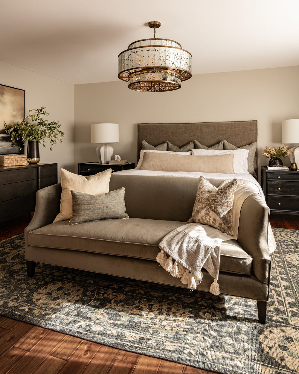
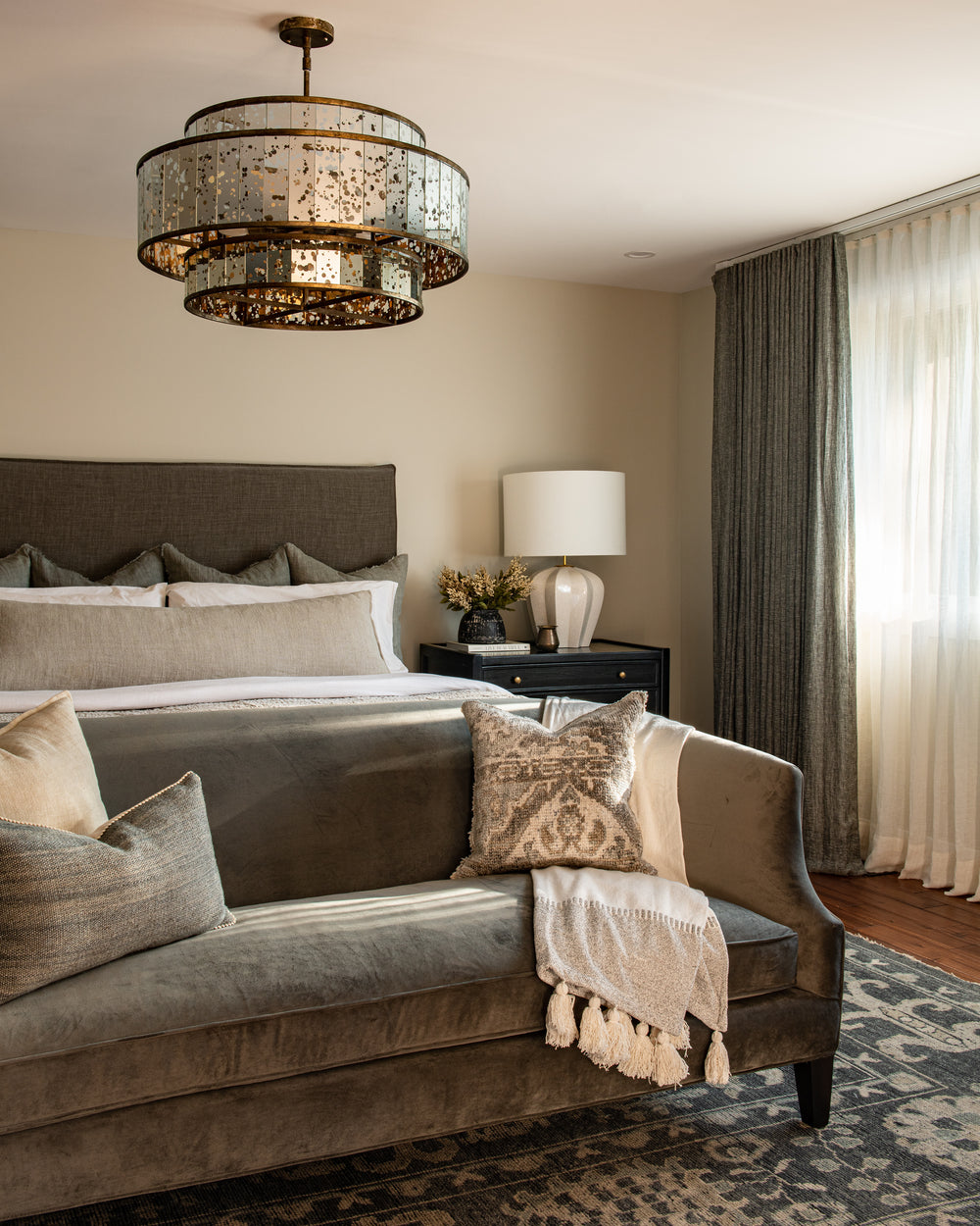
The bedroom was kept neutral and monochromatic with tones of greige. The Villa Bed in Sahara Taupe creates a simple backdrop for ample pillows and bedding from the shoppe, like the textural quilted coverlet. Mahogany nightstands in a hand-rubbed, black stain finish ground the large room and add some drama, while the Pierrepont Table Lamp add a touch of whimsy. It’s not every day you can fit a settee on the end of the bed, so we jumped at the opportunity in this bedroom to add the Montgomery Sofa in the ‘Austin Pewter’ velvet. One of our favourite dressers ties in the dark tones throughout and adds lots of storage, which we paired with the Everlasting art print and Beton Table Lamp from our shoppe. To create the perfect mood lighting, this epic chandelier has mercury glass and brass to cast beautiful light at night.
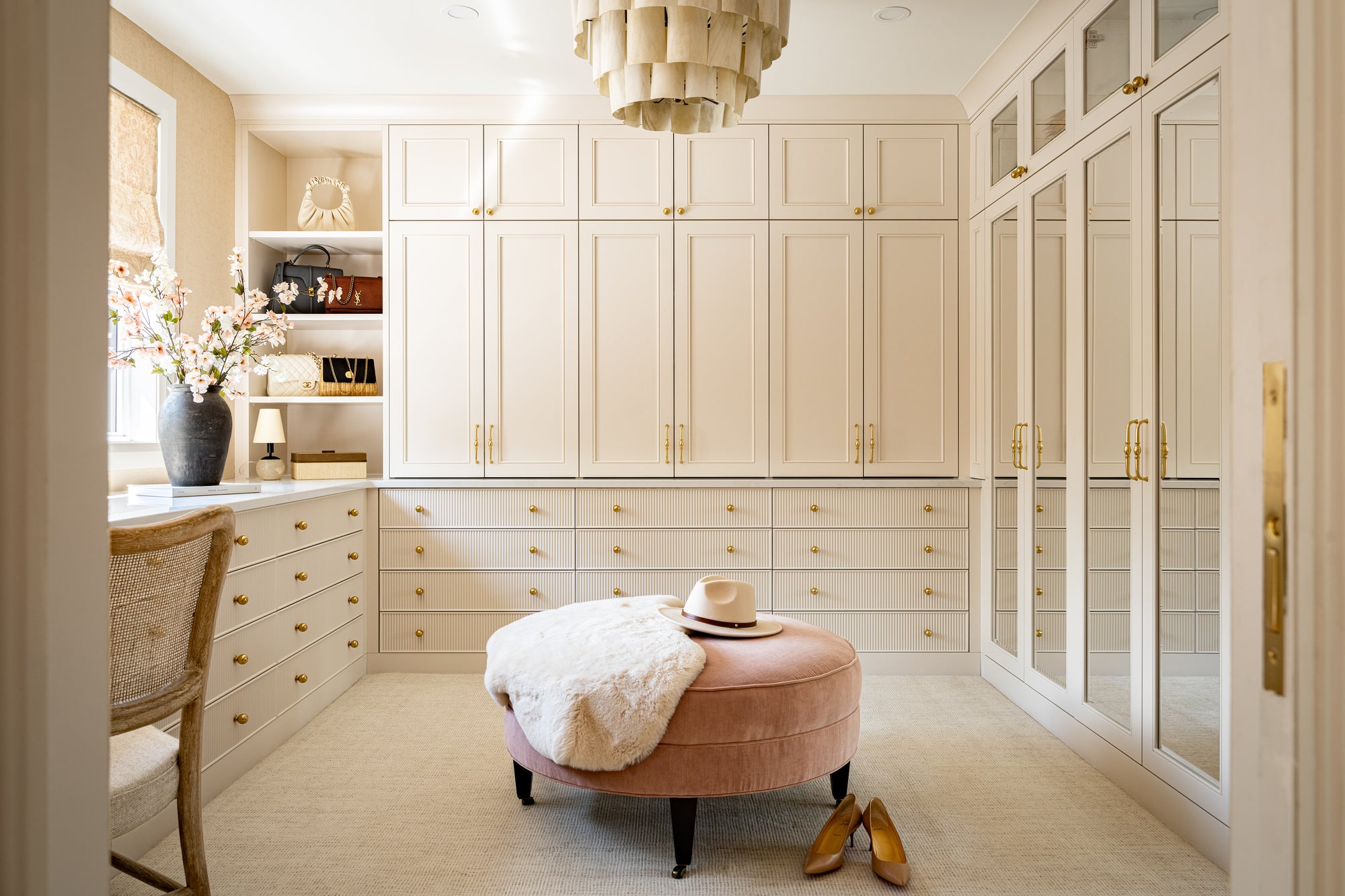
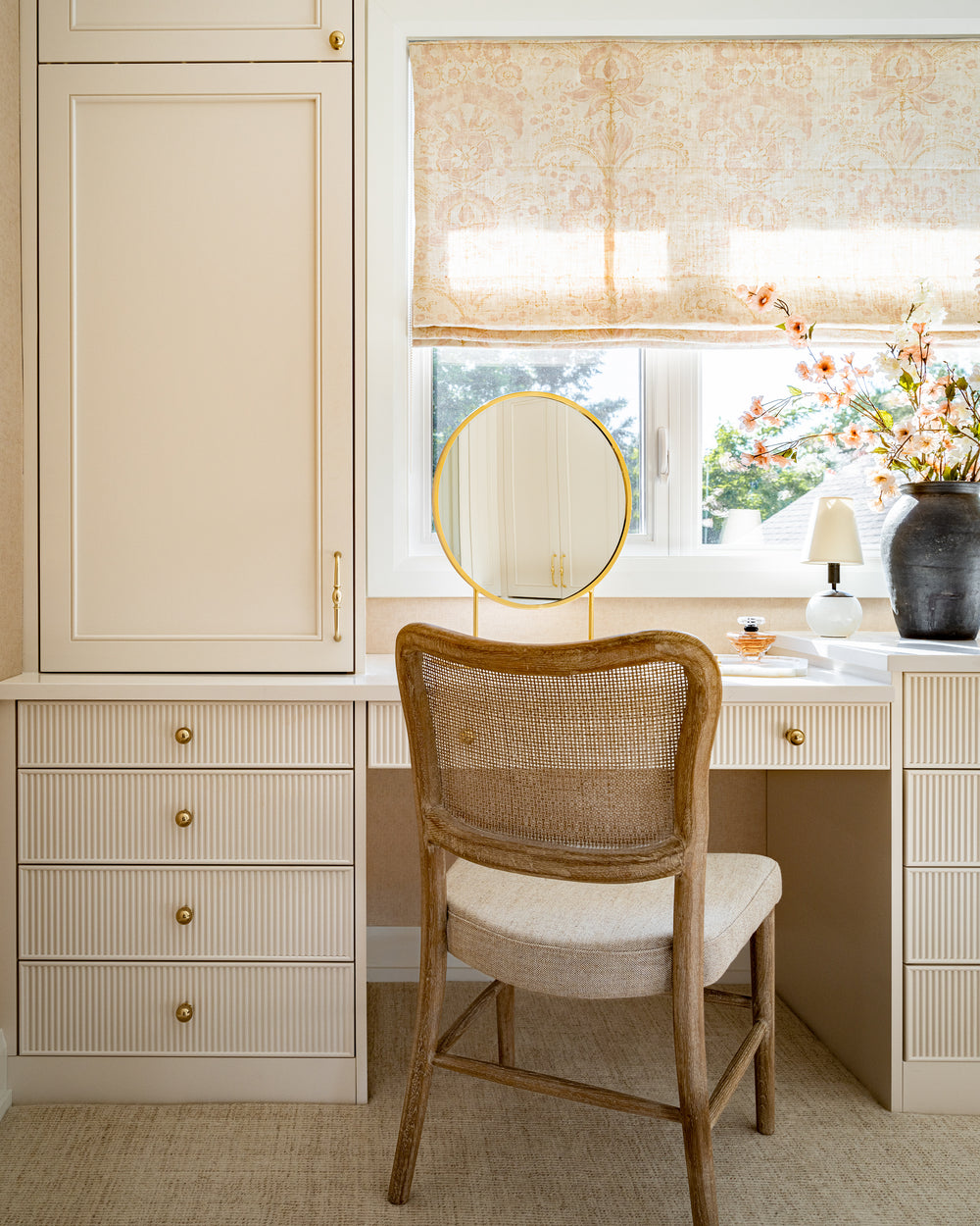
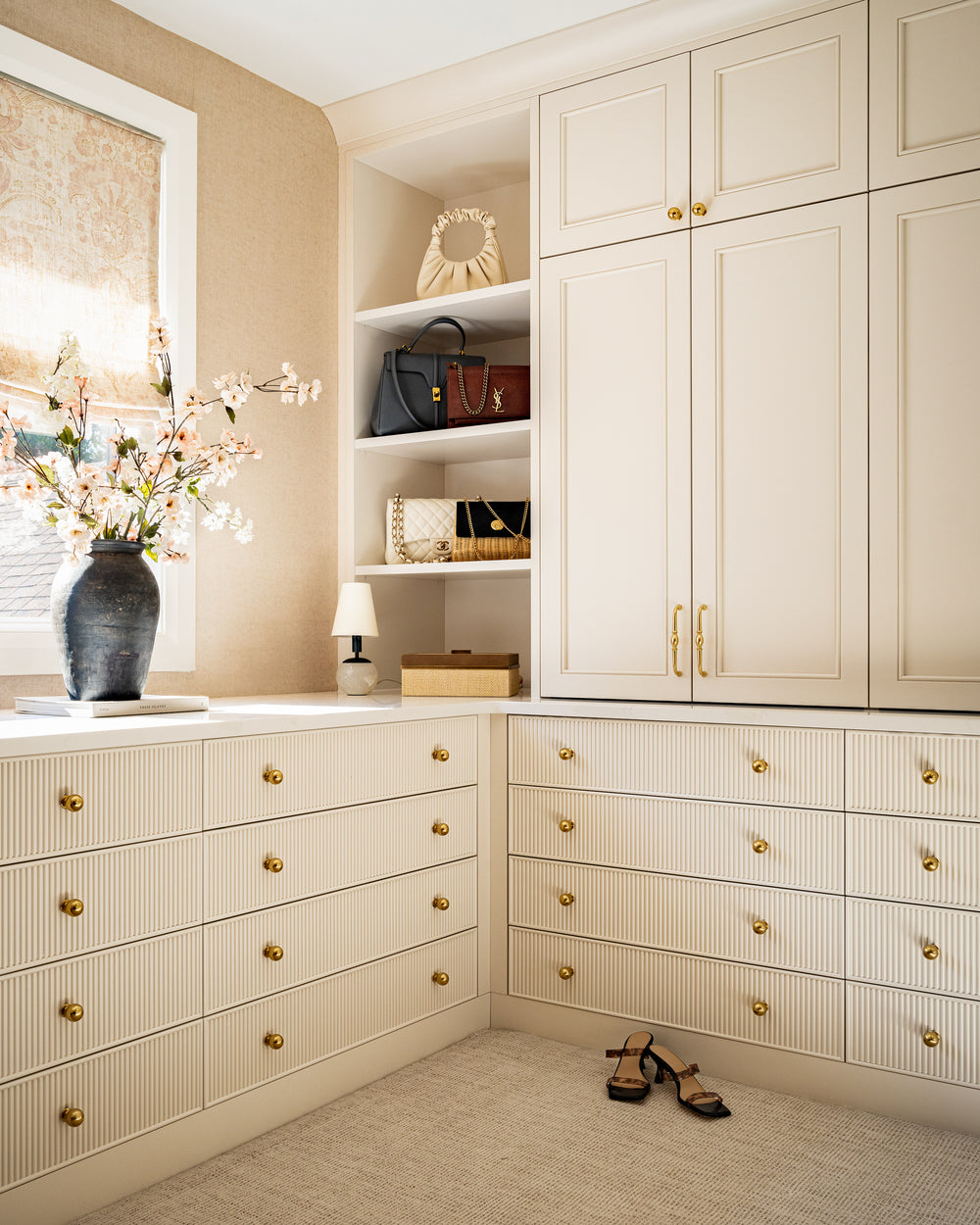
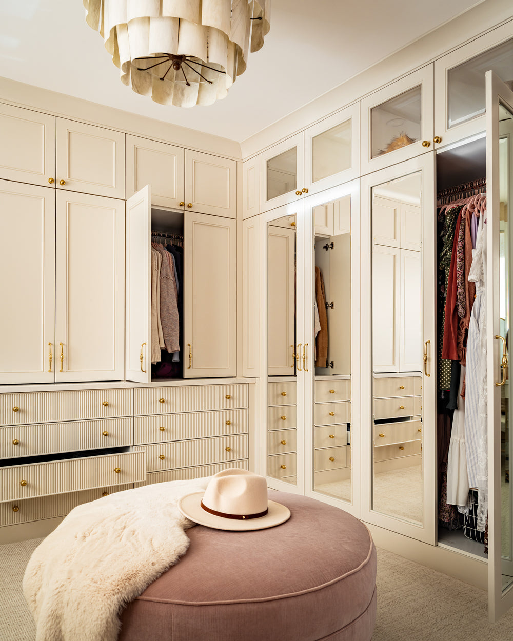
Where to begin with this luxe custom walk-in closet?! What used to be a guest bedroom is now our client’s dream oasis to get ready. Firstly, let's talk functionality. This renovation began with a lot of strategic planning, taking an inventory of each piece of clothing, accessory, and shoe to make sure there was a home for everything. On the right side of the closet, full-height hanging rods hold many long dresses and sets. We also added mirrors on these doors for getting ready, and to reflect the natural light from the large window. Along the back wall, there are shirt-height hanging rods and pull-out shelves for folded items, and underneath we opted for drawers with individual organizers for belts, hats, etc. Along the left side of the room, more drawers sit next to a vanity for doing makeup and hair. We designed a custom pull-out hair appliance drawer to hide any wires to the left of the vanity. This vanity also has the best natural lighting for getting ready because it faces the window overlooking the backyard. A tall cabinet next to the vanity adds so much storage for extra toiletries, and the hooks on the wall are a perfect spot to hang your outfit of the day, robe, or even any pretty items you want on display.
We kept our material selections quite feminine with curves, blush tones, and reflective surfaces that sparkle. All of the custom cabinetry is painted in a dreamy "China White" by Benjamin Moore, and we chose to do two different door styles to add lots of texture. A cushy wool carpet is so comforting underfoot while perusing every outfit option. Keeping with the coastal Hamptons aesthetic, the banana bark flush mount chandelier gives off such a warm glow. When you need to take a seat, or layout some outfit options, we added a round custom pink velvet ottoman from our WoM Collection. The roman shade, also a fabric from the WoM Collection, ties in all of the creams and blush tones throughout, but also adds privacy and light control.
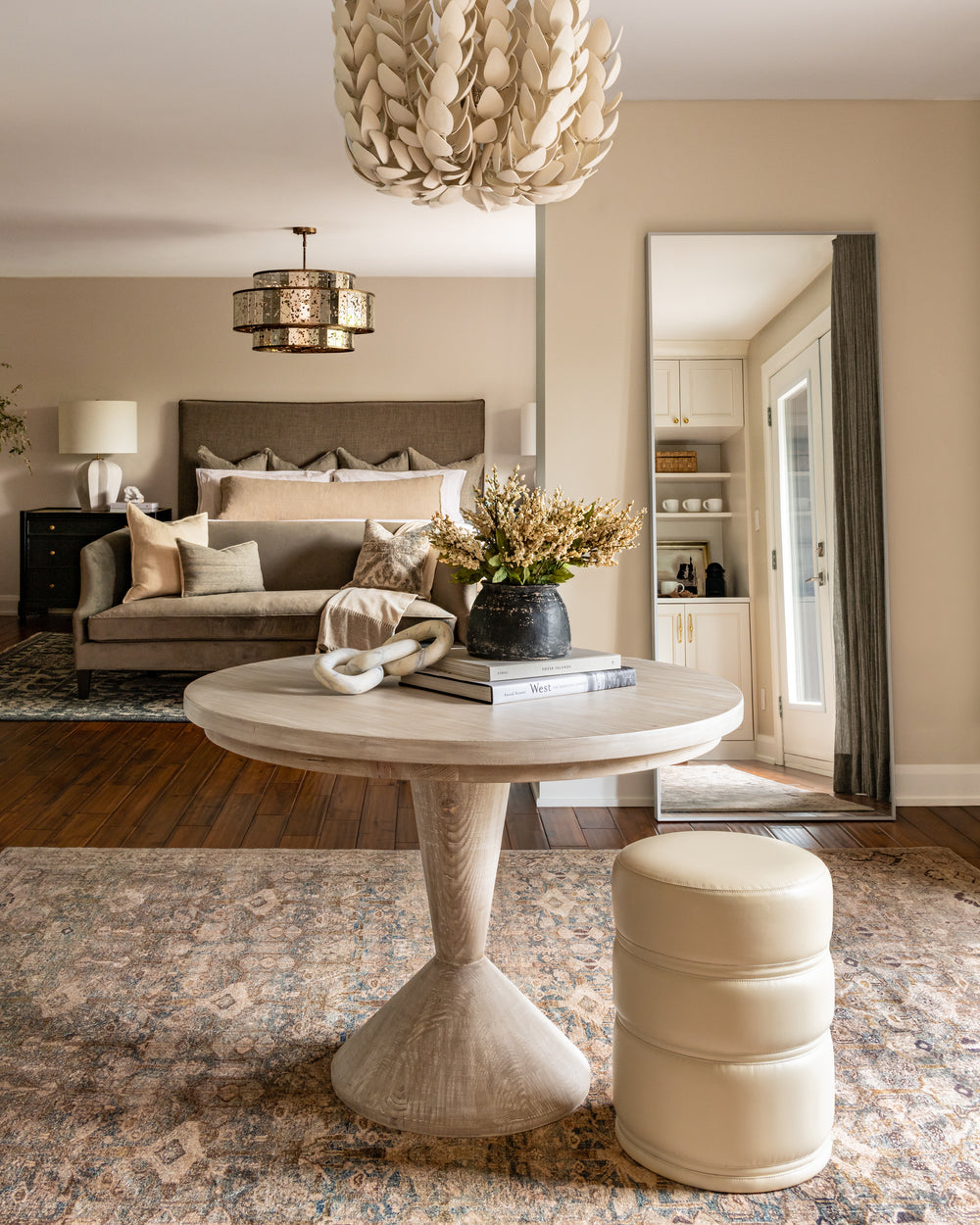
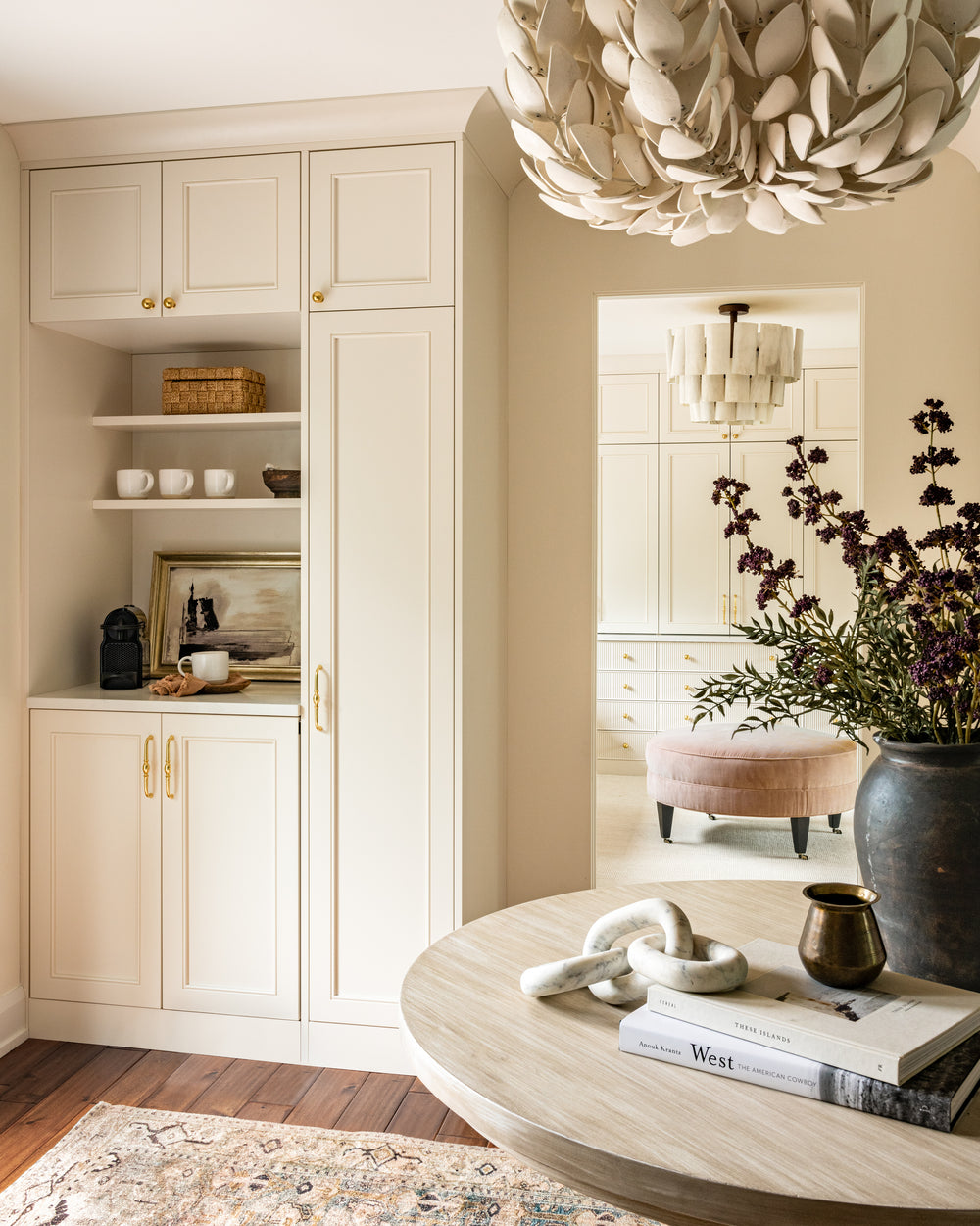
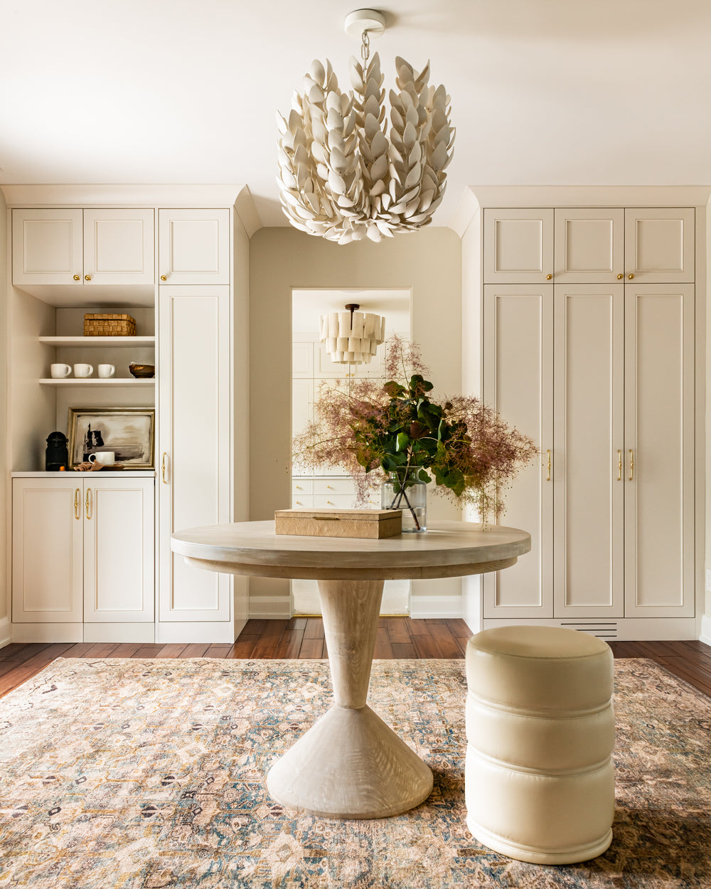
When you enter the room, you are greeted by a landing area, which we wanted to make an impactful moment to introduce you to the entire suite. The french doors out to the balcony are centred behind the grey-washed wood pedestal table with a delegate base. The beach-inspired chandelier in this area has hand-cut coco shells and illuminates any seasonal bouquets atop the pedestal table. To ground this area, we chose the oh-so-soft Margot Area Rug that has tones of sage and ivory. The closet cabinetry spills out into this entry space, flanking both sides of the closet pocket door. This houses a morning bar with a hidden mini fridge, coffee machine, and storage – no need to go to the kitchen for your morning coffee (or evening champagne)!
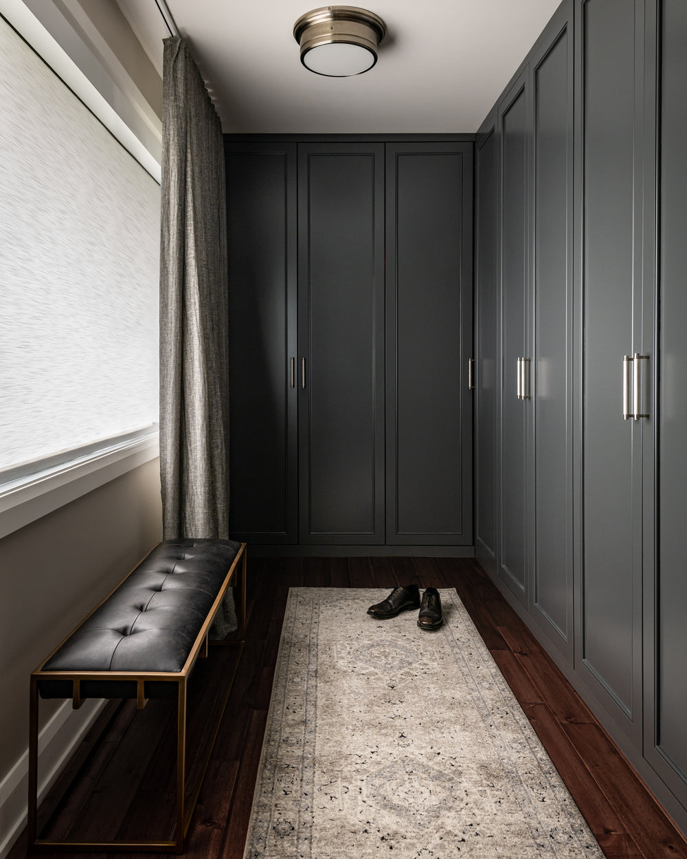
On the opposite end of the suite, "his" closet boasts rich charcoal cabinetry in the same shaker profile with bead detail as "her" closet. We opted for a more masculine polished nickel hardware with a knurled detail that matches the Siena Flush Mount light fixture. Ample storage and a black leather bench make this closet not only beautiful, but also functional.
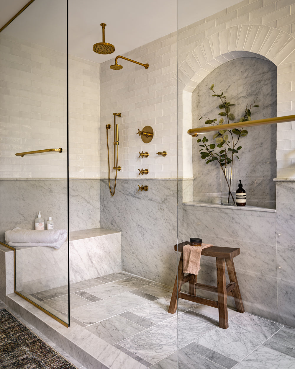
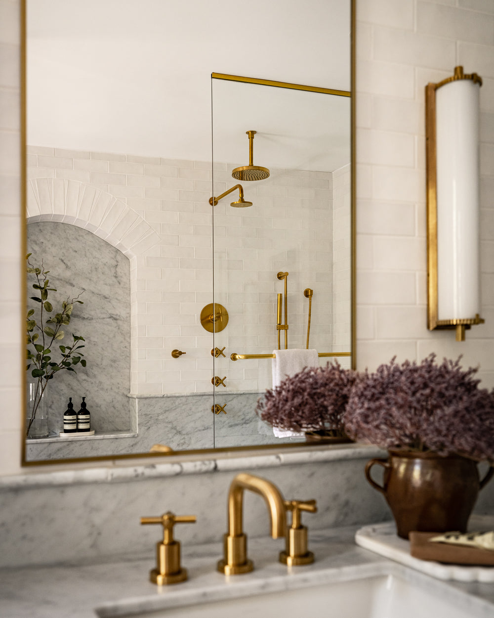
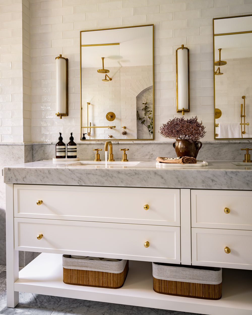
Some clients just aren’t bathtub people! The renovation of this ensuite bathroom was a complete transformation. We removed the tub and shower combination to give our clients one grand double shower. Carrara marble was our main finish inspiration, which we applied on the walls in full slabs, pencil wall mouldings, and a two-toned patterned floor. White subway tile clads the upper half of the wall, including around the arched niche. A simple new double white vanity with brass hardware ties in with the brass plumbing fixtures from Rubinet. Complete with Calliope Wall Sconces and mirrors from West Of Main Shoppe, this bathroom feels like a spa retreat for every day.


